The most engaging websites are attractive, intuitive, and easy to navigate—those are principles that apply to nonprofit and charity websites just as much as they apply to for-profit sites.
Even more importantly, charity websites reflect their nonprofit’s unique brand and mission. Potential donors should know the minute they land on your website that it belongs to you, and they should get a feel for your work and mission.
To help you design a compelling website, we’ve collected some outstanding examples of charity websites from nonprofits just like yours—all designed by real nonprofits using Neon Websites!
Here are the organizations we’ll highlight:
- Erie Neighborhood House
- Concrete Safaris
- Lakewood Service League
- International Neighbors Charlottesville
- Islamic Scholarship Fund
- New York State Dispute Resolution Association
And because we just can’t stop highlighting great nonprofits, we’ve added these organizations to the list:
We’ll walk you through each organization’s mission and why their charity websites are so great.
1. Erie Neighborhood House
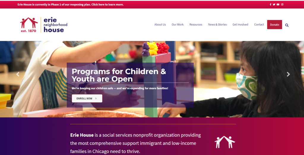
Who They Are
Erie Neighborhood House is a Chicago-based nonprofit that provides immigrant communities with legal services, ESL classes, mental health services, and more.
What Makes Their Charity Website Awesome
They share what they do.
On Erie Neighborhood House’s homepage, they give a clear and brief explanation of their organization and their services. Then, in the next block, they divide all their service offerings into five categories.
What’s great about this layout is that anyone could stumble onto this website, and, in a minute or less, they would be able to easily understand who this organization is and what it does.
They keep their charity website updated with current events.
The banner module at the very top of their website keeps their constituents informed on their reopening plan. Additionally, the slideshow of images includes their most recent fundraising campaign and the enrollment link for their reopened child and youth programs.
Keeping charity websites updated is very important—this is the first place your constituents will go for updates from your nonprofit. Try to find a place on your homepage to share news, updates, and other announcements.
They make it easy to donate.
The top navigation includes a “Donate” button in a standout color (red on a white background) that can be accessed from any page.
By making this button clear and visible on every page, Erie Neighborhood House reduced any potential roadblocks to receiving a donation.
Neon One Tip: Once a visitor clicks the “Donate” button on your website and moves onto your donation form, don’t try to replicate every single element of your website. Include your organization’s logo, colors, and look and feel, but get rid of your website’s navigational elements as they can prove distracting. For Neon CRM users, the system’s branded donation form templates come with best practices built in—and they integrate seamlessly with Neon Websites.
2. Concrete Safaris
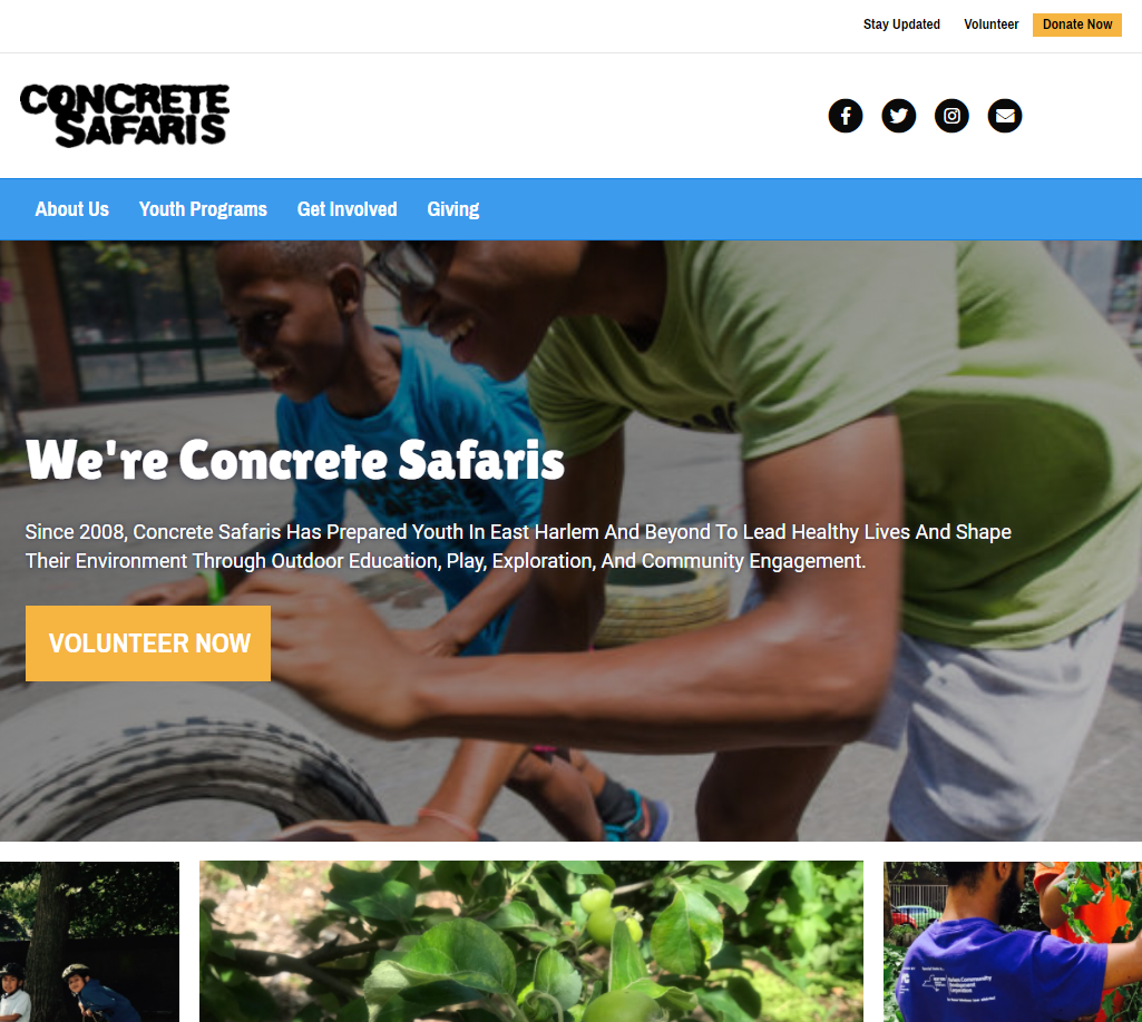
Who They Are
Concrete Safaris is an organization in Harlem that provides engaging, active, outdoor after-school programs for children grades K-5. They also offer paid internships and leadership opportunities for young adults.
What Makes Their Charity Website Awesome
They use a compelling hero image.
Their images represent their program in action. This gives potential donors and volunteers a window into what Concrete Safaris’ programs do and what they accomplish.
They have interactive pages that emphasize the important things.
On most of Concrete Safaris’ pages, there are animated page elements that add some interest. On their homepage alone, you can scroll down to see different text boxes appear as you scroll.
The data block that shares member and volunteer participation numbers has visual animations that rotate around the page. See it for yourself!
They use consistent branding and colors.
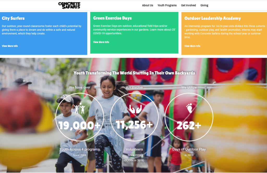
As seen above, Concrete Safaris has chosen blue, green, and orange as their brand colors. The logo was made using a unique and memorable font.
By selecting colors representing their program’s environmental and outdoor focus, a snappy organization name that encompasses what their nonprofit is all about, and a unique, eye-catching logo, they’ve done excellent branding work.
Those design elements are consistent across all of their site’s pages, too. Using your brand colors, logo, and fonts on all of your pages creates a smooth experience for your site visitors.
If you’re interested in learning more about how to optimize your website to give visitors a great experience, check out our Website Optimization Action Plan. There’s a whole module dedicated to branding!
3. Lakewood Service League
Who They Are
The Lakewood Service League is dedicated to improving many different facets of the Lakewood and East Dallas community, from the economy to education to cultural and civic conditions. They do so by mobilizing their members to complete projects around the community and neighborhood by donating to other charitable organizations in the area.
What Makes Their Charity Website Awesome
Their mission is at the forefront.
The very first thing you see under the logo and navigation are the Lakewood Service League values: Community, Service, and Friendship. Anyone can understand and relate to these values—they’re clear, compelling words that will inspire the right audience to get involved.
They include social sharing buttons.
The Lakewood Service League features icons at the top of their homepage that their supporters can use to share information with their networks with the simple click of a button! Through this feature, the organization can bring in more new donors and members from social media.
It is all about making it easy for your supporters to spread the word!
It’s designed with simplicity.
This website doesn’t need a bunch of bells and whistles to look attractive! Instead, Lakewood Service League has simply included a navigation bar, logo, mission, and what they do.
This simplicity highlights their crucial content and makes their website more accessible for users to navigate.
Is your nonprofit’s website fully optimized? Take our Website Optimization Assessment to learn if your site needs an upgrade.
4. International Neighbors Charlottesville
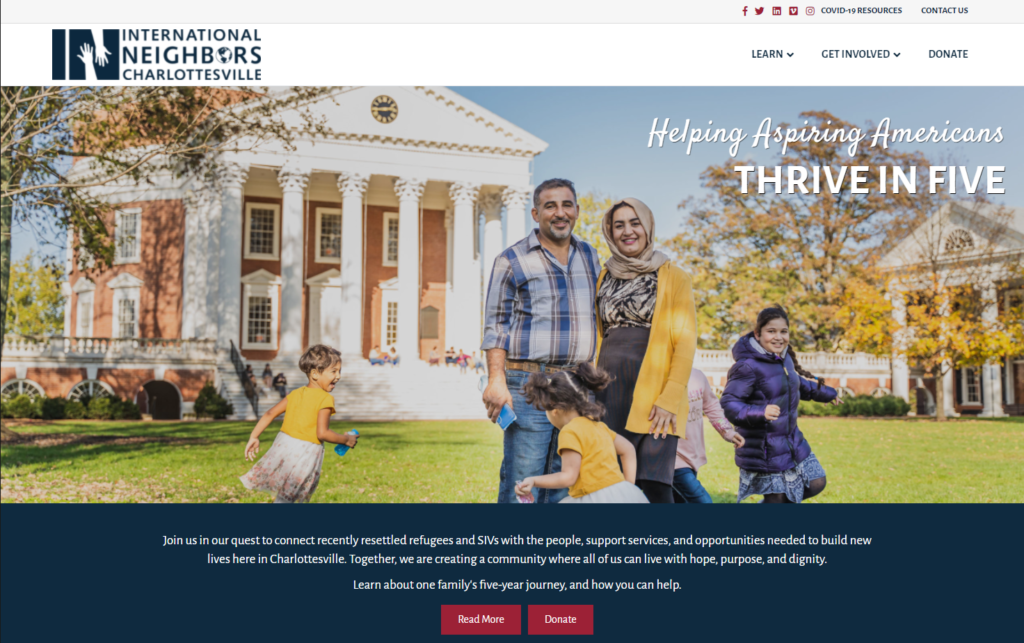
Who They Are
International Neighbors Charlottesville (INC) is a nonprofit that helps refugee immigrants acclimate to America, get the skills they need, and find success, including employment assistance, navigating the US healthcare system, and providing families with donated necessary goods.
What Makes Their Charity Website Awesome
They include a catchy tagline.
Just below their navigation bar in the top right corner of their hero image, they include their tagline, “Helping aspiring Americans thrive in five.”
The great thing about this tagline is that it’s not only catchy, but it also quickly explains the work their nonprofit does: To help immigrant families prosper in less than five years.
They’re people forward.
The design of the website reflects the organization—it’s people-oriented. You can see images and stories of families helped by INC on almost every page.
They also spotlight volunteers on their site to make them feel valued and recognized. You can tell the team at INC really has strong relationships with their volunteers. This is great for maintaining relationships with existing volunteers, and it signals to potential volunteers that they’ll be a valued part of the community.
This is a great example of how to illustrate the value of a charitable program.
Their navigation is intuitive.
There’s a navigation bar at the top of the site that can be accessed from every page. It includes short, clear titles so that users will never have any doubt about how to find the pages they’re looking for.

5. Islamic Scholarship Fund
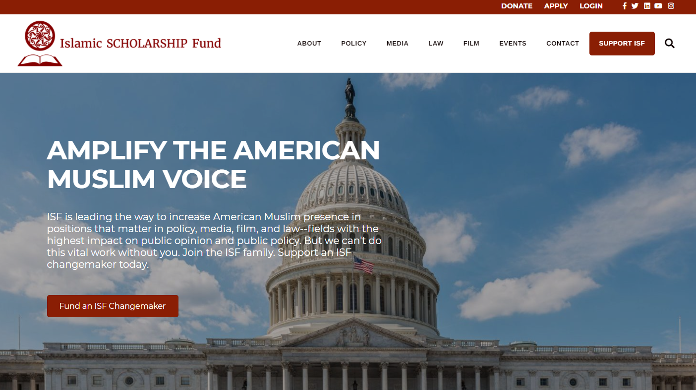
Who They Are
Islamic Scholarship Fund strives to find and support the next generation of American Muslim leaders and get them a seat at the table in policy, law, media, and film positions.
What Makes Their Charity Website Awesome
They provide many ways to give.
Islamic Scholarship Fund (ISF) fills their web pages with content that inspires and prompts visitors to donate. In addition to an easy-to-click navigation item that takes people to their donation page, they also share all the ways you can support them in different subpages: A standard donation, stock donations, or through their endowment fund.
As a bonus, they include a matching gift research tool on their donation form brought to you by Neon One partner Double the Donation.
By providing their potential donors with many giving options, ISF is helping their donors find the type of gift that works best for them.
They include powerful calls to action.
If you scroll through the carousel on ISF’s homepage, you’ll notice that many buttons use the same specific phrase: Support a Changemaker. These calls to action prompt you to donate in a way that stands out and explains exactly what the donation goes toward: funding an ISF changemaker.
Their logo is in the top left corner. It’s a standard web design practice to include your logo in the top left corner of the site and link back to the homepage. Islamic Scholarship Fund does this with a logo that summarizes the organization efficiently and elegantly.
Neon One Tip: Our partnership with Double the Donation and their 360MatchPro platform allows Neon CRM users to automate their gift-matching fundraising and gain actionable insights. Learn more about our integration with Double the Donation in the Neon One Partner Directory.
6. New York State Dispute Resolution Association (NYSDRA)
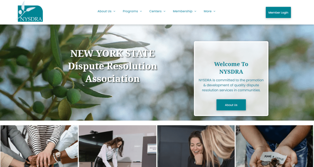
Who They Are
New York State Dispute Resolution Association, Inc. (NYSDRA) is a membership organization that promotes quality conflict management and peaceful dispute resolution. Through the support of its members and in partnership with Community Dispute Resolution Centers across 62 counties in New York State, NYSDRA provides services to over 74,000 New York residents every year.
What Makes Their Charity Website Awesome
They clearly highlight how to use their website.
There are different groups of people who will visit your nonprofit’s website, and that site has to work for all of them! NYSDRA’s website works great for all its different constituent groups, including members, donors, potential clients, and first-time visitors looking for more information.
Below their hero image, their homepage features four boxes highlighting the top four things visitors would be looking for. The boxes are labeled:
- Programs: What We Do
- Events & Trainings: Get Involved
- Become a Member: Join Our Network
- Donate: Join the Giving Circle
All constituents are covered. Clients can visit the programs section, current members can look up events and training sessions, prospective members can apply to join, and current or potential donors can make a gift. It’s all right there!
Their branding is strong.
NYSDRA’s brand colors are based on various shades of green, and those colors are used consistently throughout the site, with a bolder green serving as their primary color while lighter shades are used as accents.
In a particularly nice touch, there is even a brief section in the middle of their homepage that explains the significance of the olive branch in NYSDRA’s logo as a symbol of “peace and friendship.” That’s a great way to reinforce their commitment to conflict resolution and mediation!
Their name is front and center.
When you’re an organization that has a longer name and goes by an acronym, as NYSDRA does, it can be helpful to put your full name front and center on your homepage.
And that’s exactly what they do! The association’s full name is layered on top of its hero image. It’s literally the first thing you see when you arrive on the site.
Just in case a new website visitor is worried that they might not be in the right place, NYSDRA’s website puts that worry to bed.
It includes a sticky header.
When you scroll down NYSDRA’s website, the header at the top of the page doesn’t disappear. It follows you down the page.
That’s called a sticky header, and it’s a great way to ensure that your visitors always have easy access to the rest of your site.
NYSDRA’s site also makes good use of its footer, which includes their address, contact info (phone, fax, and email), plus links to all their social media channels.
Do You Know Your Donors?
They’re more generous than you might think … and we have proof. Download The Generosity Report today!
Even More Great Charity Websites
We were going to stop at six examples of great charity websites. We even put the number “6” in the URL! But too many of our Neon Websites users are creating outstanding charity websites, so here are a few more examples.
7. Sense of Security
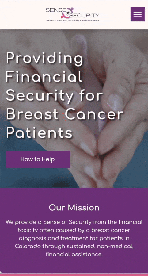
Who They Are
This organization provides a financial “Sense of Security” and enhances the quality of life for Colorado breast cancer patients in treatment. To date, Sense of Security has provided more than $2.2 million in “housing, utilities, groceries, transportation, insurance premiums, and other basic living expenses” for nearly 2,200 Coloradoans.
What Makes Their Charity Website Awesome
They have an eye-catching animated hero image.
The moment you land on their website, visitors are greeted by an animated hero image of two hands cradling a pink ribbon. That animation makes a big impression—and it does so without being slow to load! The design is mobile-friendly, too.
Using an animated image like this is a powerful way to catch someone’s attention. If you choose to try this tactic on your own website, do some testing before publishing the change. Your page should load quickly! If your animation slows down the page, keep a static image until you can figure out how to reduce the file size.
They include videos on their homepage.
When you scroll through Sense of Security’s homepage, you’ll see content and images that share about their work and their impact. You’ll also find videos that share, among other things, testimonials from people who have benefitted from the organization’s support.
Including videos on your website is a great way to connect site visitors to the people they’ll help with their support. According to the nonprofit marketing agency Nonprofits Source, 57% of people who watch a video go on to make a donation. Whether you include them on your homepage or on other pages, add some of your videos to your site.
They Make It Easy to Volunteer
When site visitors hover over “How to Help,” they see an option to volunteer. The volunteer page includes information about volunteering at events and in other capacities, like serving as an administrative assistant, mentor, intern, and more. Anyone interested in volunteering can fill out a simple form to learn more.
8. Autism After 18
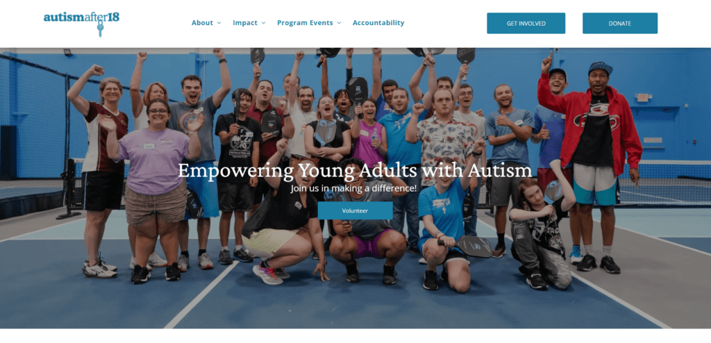
Who They Are
Autism After 18 is an organization based in Charlotte, North Carolina. They “work to help young adults with autism progress toward independent lives, whether in terms of socialization, education, or starting careers.”
What Makes Their Charity Website Awesome
Their donation page looks and feels like the rest of their site.
Autism After 18 uses shares of blue throughout their site, and they include lots of pictures of their community on their homepage and other pages.
Their donation page is no different! When site visitors click over to make a donation, their donation form includes the same shades of blue, the organization’s logo, and an image that fits well with pictures from other pages. This consistent branding creates a sense of continuity for users, and helps maintain the emotional connection they had that made them interested in donating in the first place.

They highlight their impact.
The site’s navigation menu includes an “Impact” item where people can get the latest news about the organization, visit their YouTube channel, and scroll through photos from events and programs. This is a great way to create a sense of community!
They prioritize accountability and transparency.
In addition to sharing details about its internal and external oversight, Autism After 18 is very open with its organizational and financial information. Visitors can check out information about their board of governors, their bylaws, their Form 990, and even the Donor Bill of Rights and their Donor Privacy Policy.
This kind of transparency is an important part of ethical fundraising—and it’s a powerful way to build trust with donors.
9. Southern Conservation Trust
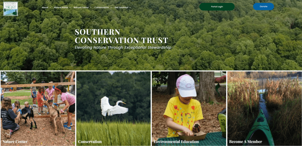
Who They Are
Southern Conservation Trust is a Georgia-based nonprofit that “elevates nature through exceptional stewardship through over 55,000 acres of conserved land and public lands throughout the southeast, including 5 public nature areas in Fayette County, Georgia, and the Fayette Environmental Education Center.” They clarify that they don’t just believe in protecting land; they believe people should have “equal access to enjoy it.”
What Makes Their Charity Website Awesome
There’s something for everyone.
Whether they’re interested in learning more about the organization’s conservation efforts, want information about their nature center, are interested in becoming a member, or want to plan a trip to one of their nature areas, visitors can easily find the information they need.
Many charity websites have different audiences. Clients, potential donors, existing donors, volunteers, and first-time visitors are just a few examples of the types of people who may need to find information on a nonprofit’s website. This organization does a great job of serving each of those segments.
They include a planned giving page.
Let’s be honest: Talking about planned giving can be really scary. Nobody loves thinking about end-of-life planning, and asking for a legacy gift can be intimidating to even the most seasoned fundraiser. Adding a planned giving page to your site won’t eliminate the necessity of having those conversations. But it can help you connect with people in your community who are interested in leaving your organization a gift in their estate plan.
There are tons of ways to get involved.
If a site visitor is passionate about conservation, it’s easy for them to find a way to support this organization’s work. Under the “Get Involved” item in the site’s navigation, people can learn more about events and programs, buy a membership, volunteer with the Trust, connect with them on social media, or subscribe to the newsletter.
Reimagine Your Charity’s Website with Neon One
A well-designed website is critical for any nonprofit. All the sites in this article convey their organization’s mission, vision, and impact in a clear way that engages all their different constituent groups.
Are you looking to build a new website? We have some good news! Neon Websites is a website builder and editor that’s designed specifically for nonprofits. It includes mission-specific templates, an easy no-code website builder, and a seamless integration with Neon CRM.
Want to learn more and see if Neon Websites is right for you? This self-guided tour will give you a feel for how you can use this platform to create a beautiful, compelling site that’s easy to maintain.