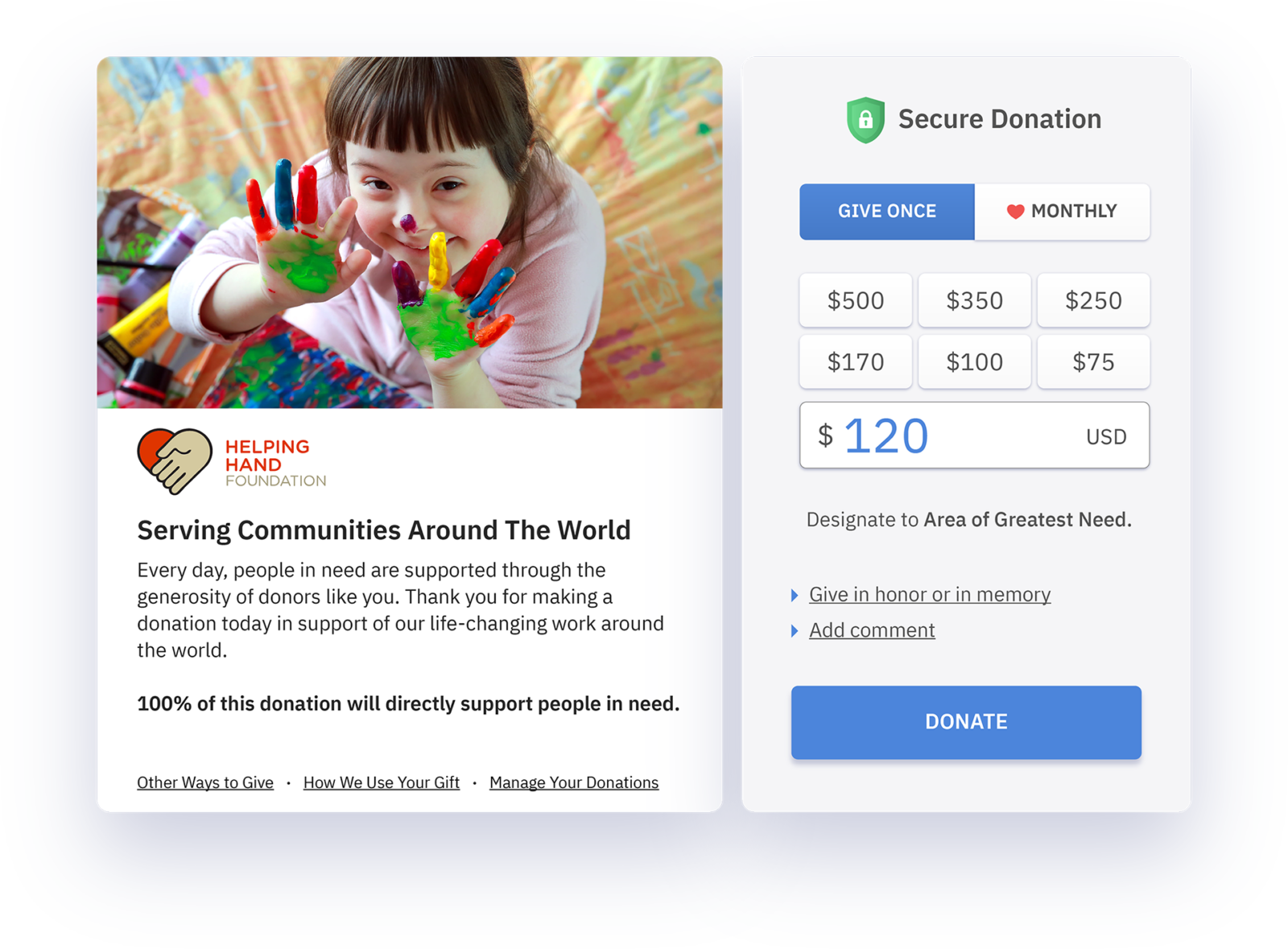
From the multiple studies looking at online donation processes for nonprofits, one theme clearly emerges throughout: consistency in branding between your donation form and website enhances donor giving levels. In fact, branded forms, on average, receive 7 times more donations than their non-branded counterparts.
At first glance, it may seem that branding your forms to match your website may seem like a straightforward task. However, there are more parts to building a perfectly branded donation (or event registration, or membership) form than you may realize.
Not sure if you’re following best practices when it comes to your online donation process? Here are some questions to consider:
Does your donation page URL match your website URL?
A change in the URL indicates a change in back-end systems, and a dramatic change can lead to less engagement.
A significant URL shift on your online forms may raise questions about the security of your forms, whether the donation is actually being made to your organization, or simply create confusion for your donor audience.
Is your website’s header and navigation on your donation form?
The header is the masthead of your website. It anchors your brand and allows your users to seamlessly navigate to other parts of your site.
By not carrying over the navigation, you are taking away an important branding icon and limiting the functionality of your donation page. Dropping the header may also signal credibility and security concerns.
Does the branding on your donation form match the branding on your website?
Once a user has become accustomed to a look and feel of a website, subtle differences may not seem so subtle anymore. While it may be difficult to be “exact” you should pay close attention to make sure the color, font, look and feel of the forms are in line with the the rest of your website.
Much like the URL changes, changes in branding call into question the security and host of your online forms.
Does the donation process or donation form contain too many steps?
In addition to being user friendly and maintaining clear and consistent branding, the optimal donation form allows users to complete their donation in 1-2 steps and provides them with immediate confirmation.
Once users get to the donation form page, they should be able to enter all relevant information on that page. After submitting, a user should get a “thank you/confirmation” message. It’s also recommended that donors receive an email with a receipt.
Want extra points? Provide people with the proper IRS documentation so they can file their tax deductible donation.
If you answered no to any of these questions, there may be room for improvement. Think of the donation process from the donor side – would you trust a donation form that differed from the website? Would you feel anxious if you never received confirmation that your donation went through?
Small but subtle changes in the donation process quickly add up, for better or for worse, in the minds of your constituents. Set your organization up for success, increased engagement, and increased donation by optimizing your donation process.