
Online donation forms are important tools for most nonprofit organizations. They’re how you process donations, sell event registrations and memberships, capture information about volunteers and newsletter subscribers, and otherwise build your community.
But if you’ve ever looked at your form conversion rates, you know that getting people to actually finish their form and click “submit” can be tough.
Even the most enthusiastic supporters will bounce if your forms are too long, confusing, or poorly designed. In fact, benchmarks from M+R found that about 80% of people who land on a donation form never complete it.
If you’re looking to build online forms for your nonprofit, optimization is going to be an important skill to master. Making small, strategic changes to existing forms can significantly improve your performance.
Let’s walk through how to create forms that make getting involved in your mission simple and easy.
What Is Optimization and How Does It Work?
The biggest reason people abandon online forms is friction. If your online form isn’t compelling, is confusing, or is difficult to fill out, people will leave your site without getting involved.
Your job is to reduce that friction by optimizing your form to make it simple, clear, and easy to complete.
The optimization process is pretty simple. It includes:
- Building a nice-looking page to house the form (this isn’t always necessary—really simple forms, like the ones you’d use to collect email addresses for your newsletter, won’t always necessitate their own pages)
- Minimizing the number of fields you include on your form
- Giving people choices
- Showing users that you value their privacy and will keep their information safe
- Testing your form
- Following up with users
All of these elements work together to give people a streamlined experience that makes supporting you easy and rewarding.
1. Create Your Online Form’s Page on Your Website
Not every form needs its own page, but many do. Donation forms, event registration and membership forms, and volunteer interest forms are all ones that really need to have their own page.
A good page will remind people why they should get involved (or educate them about it if they’re not familiar with you!), help them understand what impact their involvement will make, and keep them focused on completing your form.
To do that, you should:
- Remove navigation links and competing CTAs that could distract people during the Feature images that subtly connect your user to the community they’re supporting with their involvement
- Use short, clear statements about the impact someone will have when they get involved
You should also include your organization’s branding on this page so that it looks just like the other pages on your nonprofit’s website! This keeps the emotional connection between your user and your organization intact instead of jarring them with a page that looks very different from the other ones they’ve seen.

2. Make Your Online Form Feel Simple
An important best practice shared across all the different types of nonprofit forms is to keep the number of required fields to a minimum. Every extra question you ask adds friction! Collect only the information you need, then use follow-up surveys and other communications to gather extra details.
Answer questions like “How did you hear about us?” or “What inspired you to give today?” through other channels. If you really want to ask those questions on your form, don’t make them required.
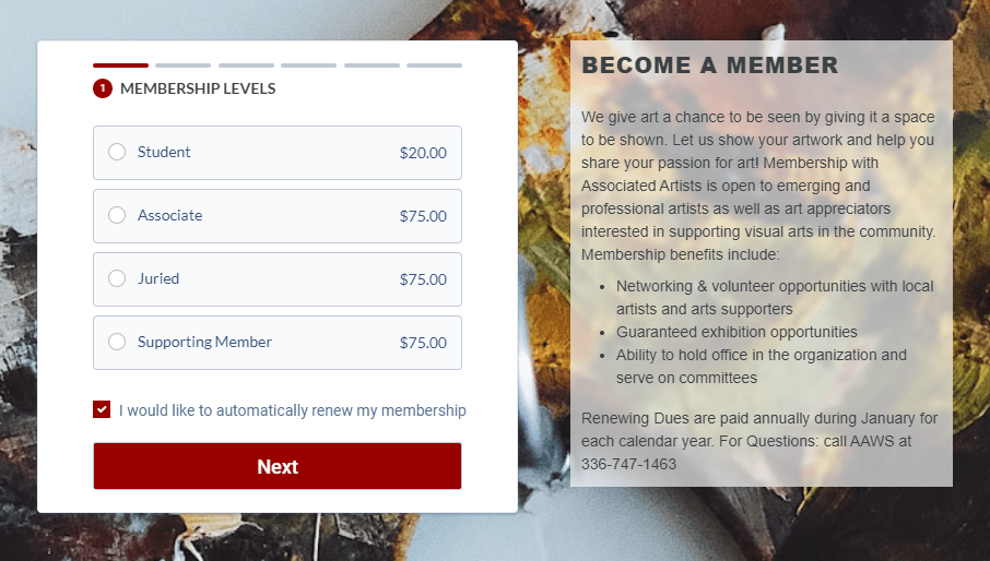
If your form is on the longer side, as most donation forms tend to be, break it into multiple steps. Long forms can feel overwhelming. Having someone commit to an action up front—like making a donation or volunteering—before having them enter their payment details will make the process feel more manageable.
Combined, these two best practices make the process of filling out and submitting your form quick and easy. That can have a dramatic impact on your conversion rates.
3. Consider What Kind of Form You’re Creating
While some best practices are universal, there are some nuances you’ll want to consider based on the type of form you’re building.
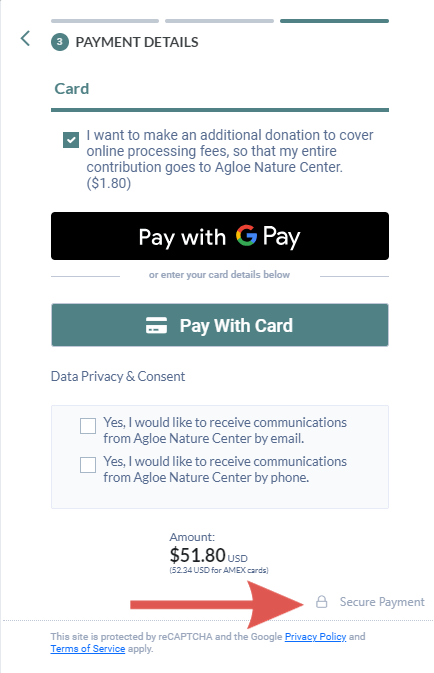
On donation forms, for example, you’ll want to give people choices. Include suggested donation amounts paired with impact statements, offer recurring giving options, and consider letting donors offset processing fees.
When you’re building membership forms, make the benefits of membership clear and offer auto-renewal to reduce member churn.
Event registration forms should include detailed information about ticketing options, event schedules, and your event’s location. All of these details will make it much easier for people in your community to decide if they want to (or can!) attend.
On volunteer forms, show people information about the different volunteer opportunities you have, and be specific about roles and responsibilities.
The information you share and collect on your page will vary based on your goals. Just remember to keep it as simple as you can!

4. Show Your Users That They’re Safe
Whether they’re making a financial gift, sharing information about their volunteer skills, or simply giving you their email address, people want to know their information is secure.
Show them that it is! You can include small security indicators on your form, like padlock icons near payment fields, using an encrypted page, or even including links to your privacy policy. These are subtle security signals, but they can go a long way in reassuring someone that they can trust you with their information.
5. Test Your Online Forms
And by “test your online forms,” we mean “get a friend or family member to test your online forms.”
It’s hard to spot issues in a form you built yourself! One of the best ways you can identify friction on your forms is to ask someone outside your organization to go through them.
Sit with them and watch how they interact with it. Have them share if they got confused, if they were hesitant to share any information, or if anything felt unclear. Their perspective can help you make small tweaks that lead to big improvements.
6. Send Timely Follow-Up Communications
Have you heard of the peak-end rule? It’s the phenomenon where people remember how they felt during the peak of an activity—like the moment they were inspired to get involved by filling out a form—and at the end of the activity. That’s why your follow-up matters so much.
Give your supporters a memorable experience by creating a confirmation page that reinforces their decision to get involved and makes them feel good about it. Afterward, send a personalized thank-you email or receipt that highlights the impact they’ll make and shares some next steps.
Don’t stop there! If it’s appropriate, send a thoughtful follow-up a few days later to share more about your work or share other ways they can get involved in your work. This kind of intentional communication can help you turn a transaction into a relationship.

Build Outstanding Online Forms with Neon One’s Tools for Nonprofits
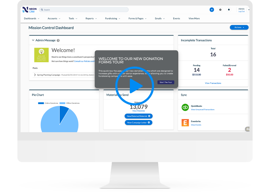
Building online forms for your nonprofit should be as easy as filling them out, and Neon One’s form builder makes that possible. If you want to get a feel for how quickly you can put together beautiful, effective forms, check out this self-guided tour of our donation form builder.
Donation Forms That Practically Fill Themselves
With Neon CRM, you can spin up an unlimited number of fully optimized, totally customized donation forms.