
As more and more of modern life moves online, maintaining a top-of-the-line website for your nonprofit becomes ever more critical. From fundraising and donor management to marketing your events, signing up volunteers, and raising awareness of your cause, your nonprofit’s website does it all.
In this article, we’ll cover the basics of nonprofit web design and the key features you should include on your nonprofit’s site. Plus, we’ll dig into three examples of awesome websites from women’s advocacy organizations that were built using Neon Websites.
Read on to discover steps you can take to create an effective website and the key features to include on your nonprofit’s site, plus three examples from women’s advocacy organizations.
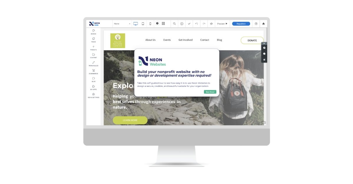
Build a Website That Works as Hard as You Do
With Neon Websites, you can use our drag-and-drop editor, stylish nonprofit templates, and seamless integrations to create a website that inspires your supporters. Learn more on this self-guided tour!
Why Do Websites Matter For Nonprofits?
Within a few seconds of landing on your homepage, a potential donor will form their initial impression of your nonprofit—a first impression that can go a long way towards informing their decision to give (or not to give).
A well-designed website will make potential donors feel good about supporting your cause, reassure them that they’re donating to a respectable organization, and give them a sense of security when they donate.
Let’s dig into the three reasons optimizing your nonprofit’s website makes a big impact.
1. Online Giving is Growing
Online giving is growing faster than you might think. Even as online giving dipped slightly in 2022, that was after several years of substantial year-over-year increases (a trend accelerated by the pandemic).
As online giving becomes increasingly the norm, donors’ expectations around online giving experiences also increase. When someone browses your site and decides to make a gift, that decision can be derailed if your donation process is clunky or frustrating.
While your conversion rates are never going to be 100%, you can improve the likelihood that someone who visits your website will complete their donation by creating an easy, enjoyable giving experience.
A compelling homepage, thoughtfully written content, clear calls to action, and a well-designed donation page will help.

2. Websites Build Credibility
Well-designed websites help nonprofits build credibility with donors and prospects. Today’s donors care about your aesthetic, so a website design that’s stuck in 2008 will come across as outdated and even unreliable.
An outdated website communicates to people that your organization isn’t diligent, active, and ready to grow in the future. After all, websites are more than a donation portal: They’re a chance to reach new audiences, educate them about your work, inspire them to get involved, and communicate your impact. When a website hasn’t been updated for a long time, it can’t effectively do any of those things.
Out-of-date websites can also impact visitors’ willingness to give. People want to donate to causes and nonprofits that are actively working to make the world a better place. If your site is inactive, potential donors may believe that your organization is inactive, too.
Outdated sites are also frequently prone to security breaches and malware attacks, which can make people think twice about entering their personal and financial information on donation forms.
3. Great Websites Keep People Engaged for Longer
Have you ever heard the joke that someone’s got the attention span of a goldfish? It’s a funny quip, but it’s inaccurate—human attention spans are actually shorter than that of a goldfish.
Goldfish pay attention for about 9 seconds, while humans clock in at a whopping 8.25. When someone lands on your website, you have mere seconds to catch and keep their attention.
Improved usability will help keep those people on your site longer. Traffic to your website is only beneficial if visitors actually read, absorb, and act upon what they read there.
When people spend more time on your site, they’ll spend more time understanding your nonprofit, the problems you solve, and the community you serve. That means you’ll have more opportunities to cultivate and engage those users.
What Does It Take to Create an Effective Website, Especially Advocacy Websites?
You want your website to drive a big impact. Some key features you should include to improve your website include:
Responsive Design
More than half of all Internet traffic is mobile traffic. If you’re like most nonprofits, over 59% of all people who land on your site will do so using mobile devices, including smartphones and tablets.
Having a website that looks, feels, and functions well on desktop computers, laptops, phones, tablets, and other devices is a critical part of reaching audiences regardless of where and how they reach you.
Responsive design makes sure websites maintain thematic consistency no matter the device while adapting appropriately to varying sizes. This ensures users can easily find, access, and interact with your site wherever they are.
Bold, Eye-Catching Graphics
Gone are the days when a simple website with a few blocks of text was the norm. Now, people expect to see videos, photos, and graphics on websites—long blocks of text aren’t as effective as video or other eye-catching ways of presenting information.
So much online communication relies on visuals, especially to entice clicks to your donation form. As you plan your website, make sure you’re using the highest-quality images possible. Even the most informative website won’t be compelling if it’s not visually appealing.
Clearly Written Content
Visuals may be more important than ever, but so is clear copy. Styled well, the text you include on your website becomes part of the visual experience in addition to educating people about your work and sharing inspiring stories.
Beyond grabbing users’ attention, your website needs to communicate value. Think about what information people will want to see on your site and how you can present it in a clear, compelling way. You might want to include:
- Educational content about your mission and work
- Inspiring stories from clients, volunteers, donors, and other supporters
- Important program information
- Event details
- Volunteer opportunities
- Information about your organization’s story, history, mission, and values
Any time you add new content to your website, ask yourself if it will be valuable to a person browsing that page. Content for content’s sake isn’t enough: Well-written content will engage your audience and inspire them to get involved.
A Strong Visual Brand
When people land on your website, do they know it’s your website? Does it include the look and feel people think of when they think of your organization?
Your logo, color scheme, site layout, images, and font choices all work together to form your visual brand. This is an important part of your overall site design! Brand identity is the image we have of a company, product, or individual. Those associations help users connect with their favorite companies and organizations, remember them, and distinguish those organizations from others.
Applying your organization’s visual brand identity to your website will help visitors connect more easily with your nonprofit. It will also make you more memorable, which increases the likelihood that a visitor will return to your website in the future.
Impact Statements, Inspiring Stories, and Updates
As people become familiar with your website, understand your content, and connect with your mission, they’ll be more likely to support you by donating, becoming a member, or offering their support in other ways.
Once you’ve got those constituents engaged with your work, make sure to give them a pleasant experience. It costs more to find new supporters than it does to keep the ones you have, so helping those people understand their impact is an important undertaking.
Make sure you regularly update your site with content that inspires donors, shows them how they’ve made a difference, and updates them about how their support makes a difference. They’ll keep coming back to your site, and they’ll be more likely to continue to support you in the future.
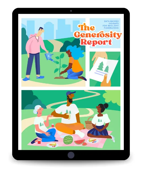
Fuel Your Mission: Engage Everyday Donors
Learn actionable strategies to effectively connect with and cultivate the generosity of your everyday supporters—download The Generosity Report now!
3 Women’s Advocacy Websites That Rock!
Now that we’ve walked through the reasons you should invest time and money into your nonprofit’s website, let’s take a look at a few women’s advocacy websites. We’ll explore three different sites and how their design choices are cutting through the noise to reach more people and make an impact.
Now that we’ve walked through the reasons you should be investing time and money into your website, let’s take a look at a few advocacy websites. We’ll explore three different sites and how their design choices are cutting through the noise to reach more people and make an impact.
Example #1: Inforum Michigan

The Mission: Inforum combines strategic connections, proven professional development programs, a respected forum for new ideas, and original research to accelerate careers for women and boost talent initiatives for companies in Michigan.
Inforum’s homepage layout makes a powerful statement. Visitors are greeted with a slideshow of professional women working together with bold text that speaks to their mission. You’re immediately drawn in as you get a general understanding of the organization’s mission and work.
Inforum keeps their branding consistent throughout the various subgroups listed on their site. Whether you’re looking to find opportunities in the automotive, healthcare, or technology industries, that consistency reassures you that you’re still browsing content on the Inforum site.

Inforum’s site is also mobile responsive. You can easily access all of the same content on mobile devices and computers. This ensures that all members, donors, and prospects can always stay up to date no matter what device they’re using.
Example #2: Financial Women’s Association (FWA)

The Mission: The Financial Women’s Association (FWA) connects a vibrant community of dynamic professionals and proactive institutions focused on development and empowerment to advance leadership growth and accelerate the success of all women in finance.
FWA’s events page includes a modern design and user-friendly navigation features, like allowing users to select upcoming events or to browse the organization’s “signature” events and sign up for a committee. Each event listing links to its own dedicated page with all of the relevant event info clearly laid out. We love the form and function of this section.

FWA’s new member registration form (powered by Neon One’s CRM for associations) is easy to use and also filled with great custom fields. It walks prospective members through the process step by step, never letting a super-long form confront them with tons of fields that can (and will) discourage people from filling it out.
Example #3: National Association of Women Lawyers (NAWL)
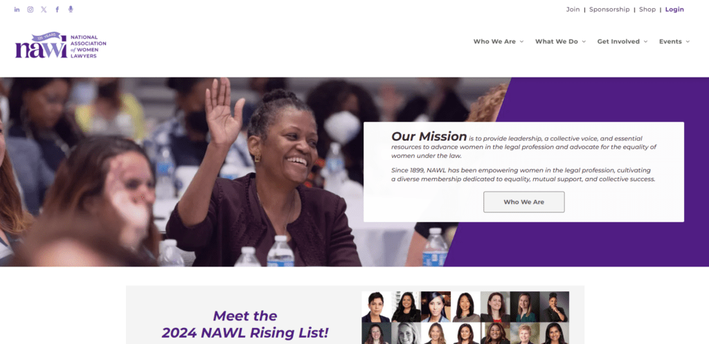
The Mission: Founded in 1899, the National Association of Women Lawyers (NAWL) has spent the past 125 years dedicated to its mission to advance women in the legal profession and advocate for the equality of women under the law.
NAWL’s website makes it super easy to find what you’re looking for. The primary navigation menu is broken out into four major categories—”Who We Are,” “What We Do,” “How to Get Involved,” and “Events.” Dropdown menus beneath each one intuitively organize and present every conceivable topic someone could be interested in.
The same logic applies to calls to action (also known as CTAs). Every page of the NAWL website has four CTAs in the upper right-hand corner for joining, sponsoring, shopping their merch store, and logging in.
No matter what you’re looking to do on NAWL’s website or what information you’re looking to find, you can get there in a single click.

NAWL has a great membership page. It breaks the overview into three distinct sections: Membership benefits, membership levels, and member testimonials. Someone looking to join NAWL can easily get a sense of why they should join before clicking through to the application form.
Further reading: You can learn more about enhancing your membership program by combining Neon One’s CRM and website platform with a real case study from California Teacher Development Collaborative.
How Does Your Advocacy Website Stack Up?
Creating a great advocacy website for your nonprofit means combining eye-catching imagery and engaging copy with an intuitive user experience and clear calls to action. The three websites we’ve included in this article all do a great job of checking all these boxes—but how many boxes does your advocacy website check?
Here’s an easy way to find your answer! Take our 5-minute website optimization assessment to get a broad outline of how your website stacks up against industry best practices and download our comprehensive website optimization action plan.
Click the button below to start your quiz!