
Let’s get the bad news out of the way: According to the latest M+R Benchmarks report, the average nonprofit donation page in 2025 had a conversion rate of only 11%. That means that, for every 100 people who land on your nonprofit’s donation page, 89 people will leave without making a gift.
Gross.
Now let’s talk about the good news: You can improve your conversion rate. Following some simple donation page best practices will create a better experience for the people who land on your page, and that will result in more donations.
Let’s take a look at how to do it.
Donation Forms That Practically Fill Themselves
With Neon CRM, you can spin up an unlimited number of fully optimized, totally customized donation forms.
Is Following Donation Page Best Practices Really That Important?
Yes!
A donor’s decision to give is usually an emotional one. People don’t approach supporting their favorite causes the same way they’d approach paying a bill online.
A bad experience on your utility company’s billing portal is annoying, but you’ll do it anyway (because you have to). But bad experience on a donation page usually results in someone leaving and doing something else.
If you want people to give, the process has to be easy and enjoyable. Creating a great experience for the people who land on your donation page will:
- Encourage people to donate (if they aren’t already committed to giving)
- Reiterate someone’s instinct to give (if they’ve already decided to do so)
- Make a positive impression on people who are simply exploring your website to learn more about what you do
- Reduce form abandonment rates—the percentage of people who start to give but quit before they finish—by making the process easy
- Set the stage for donor retention and future interactions with your supporters
With that in mind, let’s walk through each of these important donation page best practices and discuss why they’re so important.

10 Effective Nonprofit Donation Page Best Practices
From the way you format your donation page to the elements you add to your exit page, every part of your donor’s experience will impact their decision to give. Here’s how you create a form they’ll love.
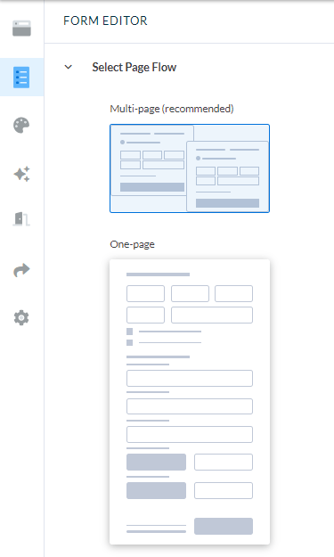
1. Choose a Multi-Step Format
Imagine you need to tackle a huge project. Do you jump into it and approach it as one monumental task? Or do you break it down into smaller tasks and milestones?
Filling out a donation page isn’t as complex as, say, planning your annual fundraising strategy. But the appearance of a long donation form can make the process feel arduous, and that can discourage donors from giving.
You can overcome that mental hurdle by choosing a multi-step donation form process. You aren’t necessarily making the giving process shorter, but you’re making it feel shorter. That’s just as important.
We could get into the psychology of why this works, but let’s be honest: You’re not here for that. You’re here to learn how to make a great nonprofit donation page! This is the first step. Make your form feel simpler by splitting it into multiple steps.
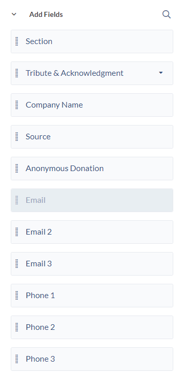
2. Simplify Form Fields
Resist the urge to collect tons of information about your supporters during the donation process. Using a multi-step form will make the donation process feel shorter and simpler, but that will be negated if you ask lots of extra questions.
Try only to include fields that are necessary for you to process the donor’s gift. If you want to collect additional information later on, try inviting them to complete a donor survey! It’s a valuable way to learn more about your supporters without clogging up your form with unnecessary fields.
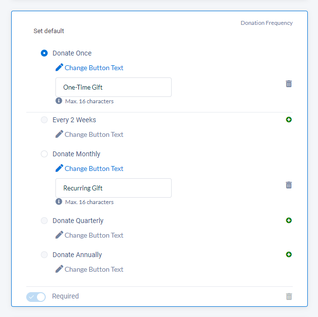
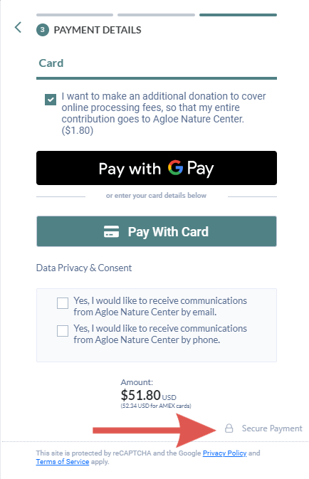
3. Enable Recurring Donations
Recurring gifts are a nonprofit’s best friend. They represent reliable, predictable revenue, and recurring donors stay engaged longer than one-time givers.
But building a base of recurring donors requires having recurring options on your form.
When you’re setting up your donation form, enable the option to set up a recurring donation. You’ll get bonus points if you also set up slightly different suggested giving amounts and a couple different “billing” options (we hate using “billing” here—it sounds too much like the utility bill example we used earlier—but there really isn’t a better term).
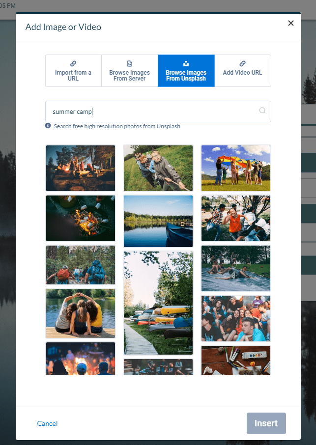
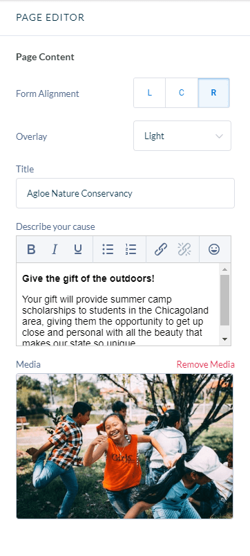
4. Add an Image
Choose a great image to add to your donation page. If someone’s already decided to donate, your picture can strengthen that decision by reinforcing the emotions that inspired them to give in the first place. If they’re still undecided—or if they’re just exploring your site—it can remind them of the community their gift will support.
Your goal here is to help donors connect with the people (or other characters, like animals at a pet shelter) they’ll help with their donation. You can achieve this by using images that:
- Depict a single character or a small group of characters
- Feel uplifting and hopeful
- Include eye contact between them and the subject or
- Make them feel like they’re “present” or a part of the photo
Take some time to find the perfect picture. It’ll make a big impression on your supporters.
5. Reiterate Your Story and Case for Support
People who land on your donation page will have varying levels of understanding about who you are, what you do, and what their gift can accomplish. Adding a few lines of copy (or even a lot of lines!) is a good way to ensure everyone has at least a basic understanding of why they may want to donate to you.
Focus on connecting your donors to the people they’ll help and the impact they’ll make with your gift. It can be tempting to talk about your organization and how great you are, but donors are most interested in making a difference. If you help them understand how they can do that by donating, they’ll be more likely to make a gift.
This is even more effective when the case for support on your page mirrors the appeals, social media posts, or other fundraising assets that inspired people to visit your donation page in the first place.
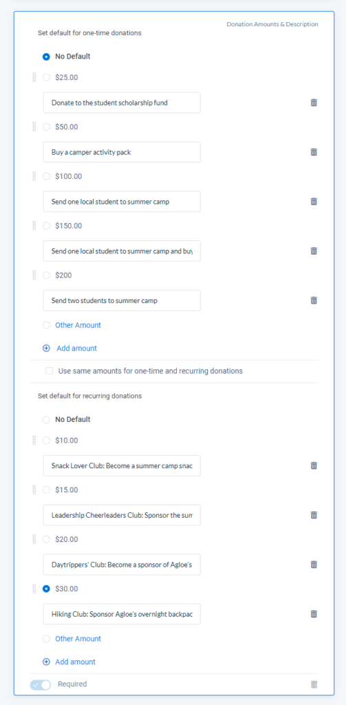
6. Add Suggested Giving Amounts …
One of the best ways to simplify your donor’s experience is to give them a few suggested donation amount options.
There’s a balance to be struck here. Adding a handful of suggested donation amounts can make it easier for donors to decide how much they want to give: Choosing from a few different options is easier than pulling a number out of thin air. On the other hand, including too many options can overwhelm donors.
Your suggested donation amounts should be reasonable for your average donor. If most people who donate to you online give between $20 and $75, try including options that range from $20 to $100 instead of starting your options at $50.
If you want to take this a step further, create different suggested amounts for recurring gifts!
Whatever you do, always allow donors to choose their own donation amount in addition to selecting one of your suggested options. If someone wants to give $20 but your suggestions begin at $30, they should still be able to give their desired amount.
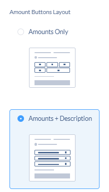
7. … And Add Descriptions
If you can, add descriptions to your suggested donation amounts that help your donors understand the impact they will make with their donation.
This is easiest if you’re raising money for something specific, but it can be tricky when you’re raising money for your general operations. If you choose to add impact statements or descriptions to your suggested donation amounts, do so carefully.
There’s a fine line between helping a donor understand their impact and being misleading about how you’ll use that money. If your donor isn’t actually paying for, say, an individual student to go to summer camp, it may be wiser to skip the descriptions.
8. Double-Check Security Indicators
Even the most passionate donor will hesitate to give if they don’t feel like your online donation page is safe. There are a few steps you can take to ensure they feel secure giving you their information.
The first is to use an encrypted page. If you’re using an integrated fundraising platform like Neon One, your donation page is almost certainly secure. You can check this by looking at your donation page’s URL. If it begins with “https,” you’re in good shape.
Another good one is a lock icon somewhere on your form, especially if it’s near the fields donors use to enter their payment information. Again, this is something your online fundraising platform will almost certainly include on your form. And for good reason: This is a low-impact but effective way to signal to donors that their information is safe with you.
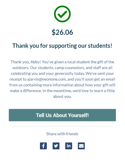
9. Update Your Exit Page
Whether you call them exit pages, landing pages, confirmation pages, or something else, remember to spend some time customizing the page someone will see when they’ve completed their gift.
While your exit page won’t impact your donation page’s conversion rate (nobody will land here unless they complete a gift!), it can impact another important metric—your donor retention rate.
The hours and days immediately after a donor completes a gift are the best time to start building relationships with your supporter. The feel-good emotions associated with supporting a cause they care about are still at the forefront of their minds, especially right after they’ve donated. Your exit page can help strengthen those feelings.
Make your donor’s experience a memorable one by including elements like:
- A sincere thank-you message
- A reminder of their impact
- A next step, like watching a video, reading an article, or following you on social media
That last bullet point is important: When a donor does you a “favor,” like watching a video or reading something, they’ll actually think more highly of you then they did before they took that action. This is because of something called the “Benjamin Franklin Effect,” which is a funny psychological quirk where our brains tell us we must really appreciate someone if we do a favor for them.
10. Don’t Forget Your Receipt
Your exit page is an invaluable place to make a positive impression on your donors. Your donation receipt is another one.
Your online donation platform almost certainly allows you to automatically send an email receipt to anyone who makes a gift. While it’s easy to reduce a receipt to a very transactional email, you can turn it into a powerful donor retention asset.
Customize your receipt with:
- Another powerful image, especially if it’s related to the one on your donation page
- Another sincere thank-you message
- A mention of how your donor will make an impact
- Another engagement opportunity, like filling out a donor survey
- A note about future communications
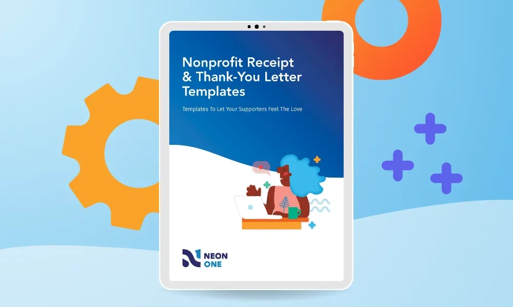
Writing a donation receipt and thank-you letter from scratch can feel intimidating. Use these templates to get started!
You’re Ready to Master These Donation Page Best Practices
Congratulations! You’ve learned the different elements of a great donation page. If you want to see an example of what a great donation page looks like, take a look at this donation form example to see how each of these elements works together.
Your own donation page will look different than the examples in this article, of course. But, whatever you do, remember this: Your goal for your nonprofit’s donation page is to get donors excited about making a difference and letting them know that you’ll use their information (and their money) safely and wisely.
If you want some help building your page, this donation page checklist has every step covered.
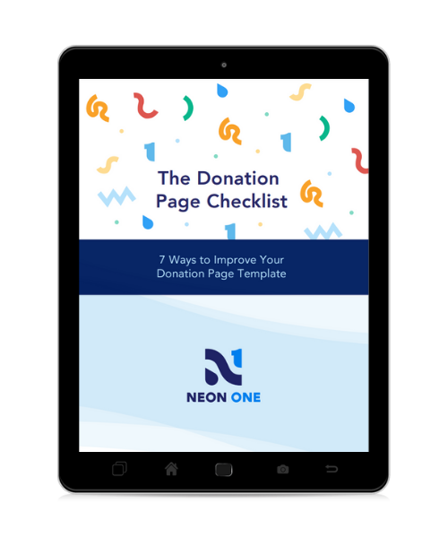
Your Donation Page Checklist
This handy dandy seven-step checklist will help you optimize your donation page for a stellar donor experience—the kind that raises completion rates and sets the stage for repeat giving.
Use a Platform With Built-In Donation Page Best Practices
Does your online fundraising platform make it easy to build effective online donation pages? Can you easily capture, store, and manage the information your donors give you when they make a gift?
Neon One can help! You can build beautiful donation pages in minutes with our intuitive form builders. And, since those forms are connected to your CRM, your supporters’ information flows automatically into your donor database. That makes it easier for you to send impact updates, build relationships with your donors, and run even more effective fundraising campaigns in the future—and that’s just the beginning.
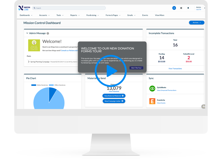
Want to see our donation form builder action? This self-guided tour will walk you through the process of making one in Neon One’s CRM step by step!