
Giving was down by 2.3% in 2023—and 2024 may not prove much better. According to the M+R Benchmarks, average online revenue declined by 1% in 2023 (which is an improvement from 2022, down by 4%). But now’s not the time to panic, and one place you can start improving and optimizing today is your nonprofit’s donation forms.
Sure, these pages seem like pretty simple assets: Once a donor has decided to give, they pop over to your forms, fill out their info, and complete the transaction. What’s there to improve or optimize?
Quite a lot! In fact, donation form optimization is a subtle art that can make a big impact on your online giving. Don’t believe us? Take a gander at these eight donation form best practices and try implementing them in 2025. It’s okay, we’ll wait.
8 Donation Form Best Practices for Your Nonprofit
It can be easy to assume that anyone who’s landed on your donation form has already decided to give. And some of them have!
But that doesn’t mean that they’ll follow through on that decision. Many supporters choose online giving because it’s an easy and convenient way to support a cause they care about—emphasis on “easy” and “convenient.”
If the process of using your donation page is too complicated or difficult, though, they won’t use it—and their gift will almost certainly be lost.
To that end, you have to build a donation form that is streamlined, intuitive, and secure to guide donors seamlessly through the donation process end-to-end.
These best practices will help you optimize your nonprofit’s donation forms.
1. Brand Your Donation Form
Your nonprofit’s brand is important: Your supporters know and recognize your organization’s logo, colors, and even typefaces.
Using your branding and logo on your donation form builds trust with your donors by signaling that your form is part of your site, not an outside third-party website.
Your brand can also create a sense of continuity for your donors. Adding storytelling elements or information about your organization on your form helps remind donors of the impact they can make by supporting your work.
Here’s some good news: Any online fundraising platform you use to create your donation form should allow you to add brand elements to your page!
2. Use a Multi-Step Form
As you set up your donation form, you’ll want to retire one old best practice.
It used to be recommended that all of your forms’ fields appear on one page. The idea was that donors only had to make a single click to make their gift.
While one-step forms required fewer clicks to make a donation, this best practice often resulted in visually overwhelming and very long forms.
The new donation form best practice is to break donation forms into smaller, more digestible screens. It’s easier for the user to see all the necessary information without overwhelming them.
It also improves conversion rates by solidifying a donor’s decision to give.
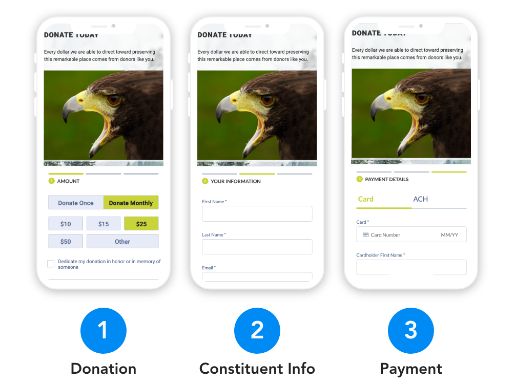
In Neon CRM, donation forms are broken into three separate pages: The first covers donation info, the second covers donor details, and the third asks for payment data.
Once donors have filled out the first section, they’ve already committed to donating; additional steps are just a formality. You can learn more about all the best practices built into Neon CRM’s donation forms in the blog post below:

3. Minimize Clicks by Minimizing Fields
The average computer user makes more than 1,000 mouse clicks per day. They shouldn’t have to use them all on your site!
Requiring multiple clicks for users to find and complete donation forms can be frustrating and cause donation abandonment.
To minimize frustration, minimize clicks.
Cut down on form fields, especially required ones. Focus on collecting the information you need to process a gift, like personal and billing information.
Some other transaction-specific fields—like dedication messages, opt-in boxes for future communications, and others—are also appropriate.If you want to collect additional information about your donors, try sending them a survey to learn about things like their motivations, communications preferences, and backgrounds.
4. Maximize Visibility
Donors change their minds quickly. If they have to click around on your site trying to find a place to make a donation, they’ll probably leave your site.
A good rule of thumb is that visitors to your nonprofit’s website should be able to get to your form in one click.
Try adding a donate button to your website’s main navigation.
Be sure it’s easy for your donors to find; make your button prominent by using a contrasting but complementary color to your navigation menu’s background.

5. Include Suggested Donation Amounts
Adding suggested donation amounts often results in better conversion rates and larger gifts.
One way they help your conversion rate is by reducing what’s called “decision fatigue.”
When a donor lands on your form with no set idea of how much they’ll give, choosing an amount can be difficult. Adding a range of suggested amounts takes the guesswork out of choosing a gift size.
This can also result in bigger donations! If a donor lands on a form intending to give $20 and sees a suggested gift amount of $25, they’ll often choose to give the slightly higher amount.
However, if you choose suggested donation amounts that don’t suit your donor base–if they’re too high or too low—that can discourage or reduce giving.
To avoid that, you can base suggested amounts on average gift size and/or create different forms with higher or lower suggested donation amounts for different segments of your donor base.
Whatever you do, always include an “Other” field where donors can enter their own gift amount.
6. Add Impact Statements
Once you have your suggested giving amounts in place, add some messaging letting donors know how their gifts of different sizes will contribute to their mission.

In the example above, built in Neon CRM, the gift sizes range from “donate to the student scholarship fund” at $25 to “send two local students to summer camp” at $200.
When creating your impact messages, try as much as you can to focus on individuals instead of large groups.
“Help feed 10,000 hungry children” won’t inspire people to give like “Help feed one hungry child for a month” will.
As a bonus: One of the main reasons donors stop giving is because they feel like their gifts aren’t making a difference. By using impact statements in your forms and communications, you’ll ensure that they never forget.
7. Protect Payment Info
70% of people are concerned about sharing their financial information online, and with good reason. Data leaks are the pits!
You can put your donors’ minds at ease by including security indicators on your form.
Something as simple as a small padlock icon indicates to donors that their sensitive payment information is in good hands.
8. Do More With Your Donation Receipts
While donation receipts don’t come until after the donation, they’re an important way to show your appreciation.
You can use this as an opportunity to reinforce your impact and encourage future giving.
Learn more about improving your donation receipts—and download some pretty sweet receipt templates—in the article below.

Create Unlimited Donation Forms With Neon CRM
Testing is one thing that always helps improve donation forms for nonprofits. Trying out various designs or formats and comparing your results can help you see what works with your donor base.
Using a CRM with unlimited forms, brandable options, and customizable content can help you create more impactful donation pages that make giving easy.
Neon CRM offers a wide range of templates that align with best practices that nonprofits can utilize to grow their donations. Want to learn more? Take this self-guided tour of our donation form builder and see for yourself!