— KEY TAKEAWAYS
Most nonprofit website templates fail teams in one of two ways: they’re so over-styled and bloated with generic pages that no board can picture their own organization in them, or they’re a blank page that someone with no copywriting background has to fill. Neon Websites’ new templates solve both.
- Approval stalls on governance, not technology: Executive Leadership holds a 63% veto rate on template selection, and Board Members hold 50%.
- Donors don’t linger on the color palette; they’re checking whether the organization is real. Every new template embeds trust anchors in the footer: EIN numbers, audited financial links, board lists, and physical addresses.
- Builder preferences flipped on contact: 63% first chose the styled template, but after 13 to 17 seconds of use, 63% preferred the instructional version with fill-in-the-blank writing prompts.
- Against the legacy layout, 77% of donors rated the updated navigation higher in ease versus 58%, and perceived trustworthiness rose from 31% to 42%.
Most software vendors treat website template design as a visual exercise. A designer builds a sleek layout, drops in glossy stock photos and lorem ipsum placeholder text, and ships it. On paper—and in sales demos—these templates look complete.
But in practice, they fail nonprofit teams two different ways. Either the template is bloated with generic pages and so over-styled that no board can picture their own organization in it, or it’s a blank page, and someone with no copywriting background has to fill it.
For nonprofits in particular, most website templates don’t answer the question of “How can this website help drive the impact of nonprofits?” At Neon One, we sought to answer that question with our data-driven website template offerings.
When we set out to rebuild Neon Websites’ templates, we treated it like a research problem, not a design problem. Over four rounds of user research and testing, we watched how nonprofit teams actually build their websites, and how donors decide in the first few seconds whether an organization is legitimate.
What we built solves both failure modes at once: Boards get something concrete enough to look at and say yes to, and staff get a system that tells them, step by step, what to write and where it goes.
The AI Xchange by Neon One
A free resource hub that helps you use AI efficiently and safely—showing you exactly what to hand off to AI and what to keep human, so you save time without risking donor trust.
Two Problems That Regular Templates Don’t Solve
Most nonprofit website builds face two major hurdles.
The first is the visualization problem: Executive directors, marketing leads, and board members need to see an inspiring, highly credible picture of what the finished website will look like before they’ll actually sign off.
The second is the process problem: Once a project is approved, non-technical staff often stall when faced with generic placeholder text, struggling to translate their mission into structured web copy.
Standard commercial templates rely heavily on generic filler text, high page counts, and locked layouts.
In our baseline donor research, legacy scroll-heavy layouts made donors hesitate right away.
In task testing, 36% of donors rated legacy scroll-dependent layouts low in ease, giving them ratings between 1 and 4 out of 7. By comparison, only 16% rated our updated navigation structure as difficult.
Interestingly, we found that templates with placeholder copy repeatedly triggered fraud alarms among prospective donors.
As one participant bluntly noted after exploring a placeholder-heavy layout, “The pages are templates that still have template verbiage, and when clicking on a topic, it only shows pictures.”
This taught our team that people often struggle with evaluating templates that use generic placeholder text, as it is difficult to imagine what could be there for a specific nonprofit.
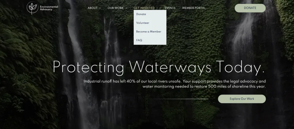
With this data, we took action: Our stylized templates are all created with highly specific placeholder content, reflective of a different fictional nonprofit for each template, so that people can actually experience how the template structures will drive nonprofit missions—rather than being forced to guess.
Designing for Both Sides of the Screen
To design templates that actually work, we ran four rounds of research in Helio, looking at both sides of the screen: the internal teams who build and approve these sites, and the donors who rely on them to learn, engage, and give.
| Round | Who we studied | Method | What we learned |
|---|---|---|---|
| 1. Donor Behavior | Active charitable givers under 45 who had donated at least once in the prior 12 months | Click tests and hesitation mapping | The three core mental models donors use to evaluate a site: Programs (assessing impact), About Us & Financials (verifying legitimacy), and Ways to Give (taking direct action) |
| 2. Content Architecture | 20 US nonprofit professionals, including strategy directors, content maintainers, and coordinators | Card sort of 17 core content cards across 6 main categories | The eight essential pages every nonprofit site requires (see below) |
| 3. Selection & Approval | 12 US nonprofit leaders across IT, Marketing, Operations, Finance, Fundraising, and Executive roles | Interviews mapping decision hierarchies and builder preferences | Where template selection actually stalls: internal veto bottlenecks, not technical evaluation, plus preferences between styled and unstyled templates |
| 4. Donor A/B Preference Test | 26 active US donors | Head-to-head usability test of the legacy template against the new one | Whether the new structure measurably outperformed the legacy layout on speed, ease, trust, and donor preference |
In round two, we found the eight essential pages every nonprofit site requires: Who We Serve (selected by 70%), Donate (65%), What We Do (60%), About (60%), Locations (60%), History (55%), Financials (50%), and Login (50%).
Once those first three rounds were done, we had everything we needed to build a new template. We combined what we had learned from donors and nonprofit professionals into a new website template, with core changes to navigation, structure, placeholder content, and trust indicators.
In round four, it was time to see whether our new template would truly make a significant impact. These donors completed tasks and evaluated sentiment in a head-to-head usability test between our legacy and new website templates.
What It Takes to Get Leadership to Say Yes
Our research revealed that template selection delays are rarely technical. In fact, 50% of nonprofits report that they can evaluate template options in three to five business days. Instead, final approval stalls due to internal governance.
Website selection is a committee decision, usually with marketing, IT, and executive Leadership all at the table (63% each). But a small group holds final authority: Executive leadership holds a 63% veto rate, and board members hold a 50% veto rate.
To help internal advocates paint a clear vision for leadership and demonstrate this potential new website’s value to their org, we corrected an early industry misconception: We don’t lock templates to rigid nonprofit verticals, forcing an arts organization into one layout and an environmental group into another.
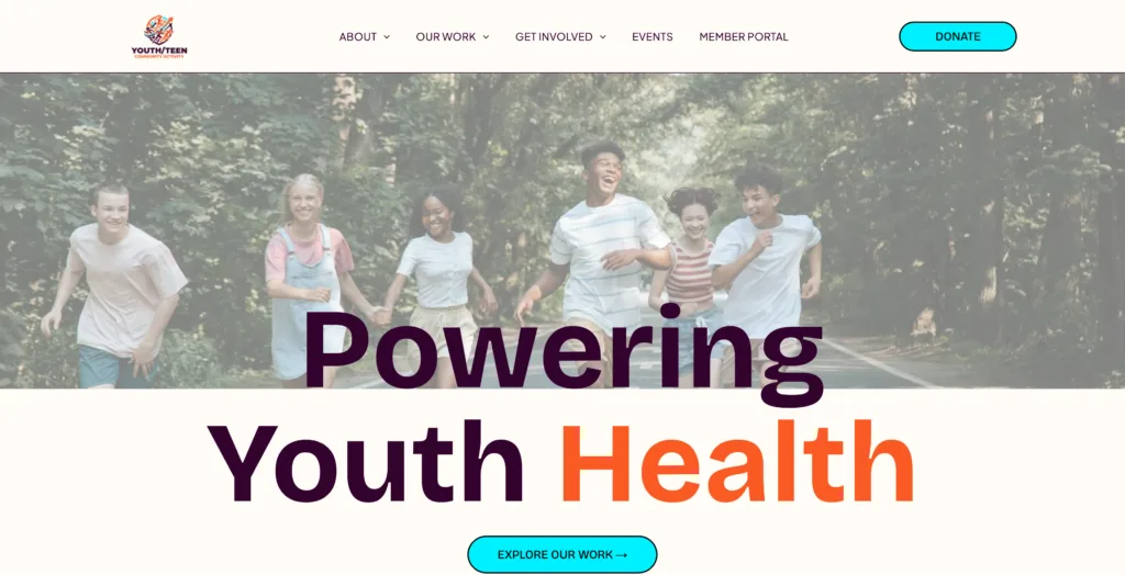
Instead, every new template shares the same research-backed navigation and trust indicators. Visual variations focus strictly on style intensity, ranging from simple to impactful.
This lets executive leaders pick a visual style that matches their brand without giving up usability.
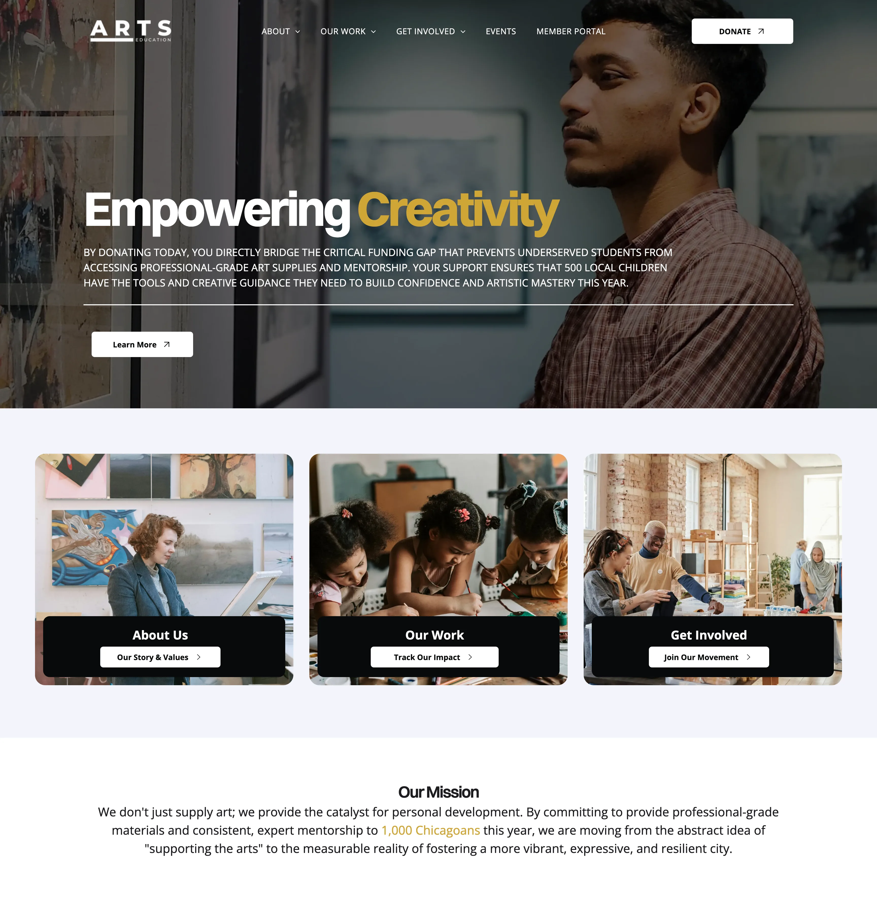
Donors don’t linger on the color palette. They’re checking whether this organization is real. Donors repeatedly emphasized that financial transparency and clear leadership details are non-negotiable trust requirements.
As one donor noted, “Some information seems to be missing, like their mission/purpose. This would make it harder to make an informed decision.” Another added flatly, “I am not giving money to an organization that does not use it wisely.”
Our research also turned up a clear mismatch: nonprofit staff hesitated to file “Financials” under “About,” but donors expected it there anyway. For them, it’s a table-stakes trust signal.
We responded by making trust structural rather than optional, embedding global trust anchors into template footers—including EIN registration, audited financial links, board lists, and physical addresses.
Fixing the Blank Page Problem
To eliminate content paralysis during the build phase, we built every page element to act as its own writing prompt.
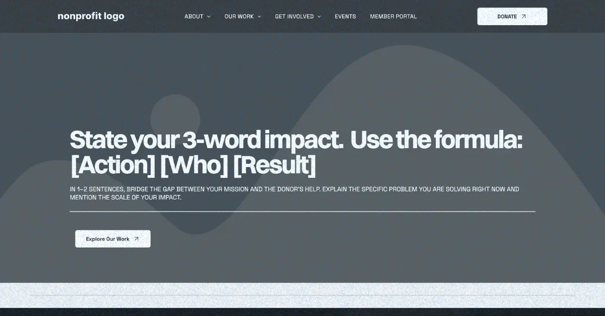
Instead of leaving non-technical staff with empty text boxes, we give builders structured copywriting formulas, such as “State your 3-word impact: [Action] [Who] [Result]” and “[Who you serve, the core problem, and what success looks like].”
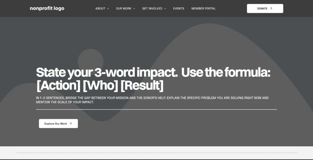
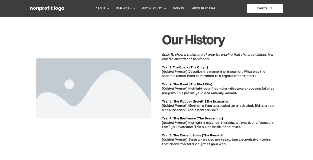
During testing with site builders, we noticed something we didn’t expect: When shown static previews, 63% of nonprofit builders initially selected visually complete “Styled” templates, while only 38% picked unstyled “Instructional” templates. Polished styled templates look “finished” and reduce initial blank-page anxiety during early review.
However, after interacting with the templates for just 13 to 17 seconds, builder preferences flipped: 63% selected the Instructional Template as their preferred starting point for building a site, while preference for the styled option dropped to 38%.
As one participant explained, “The fill-in-the-blank approach makes this template easier to understand and helps avoid accidentally reusing unrelated text from a sample company.”
Styled templates win the quick sales demo with the completed visualization. The guided prompts in the blank template, however, make the blank page less scary, and builders actually feel confident writing their own copy.

Building Your Nonprofit’s First Website?
This streamlined, nine-step checklist that walks you through everything you need to do.
So, Do These New Templates Actually Work?
To verify whether this dual approach improved real-world performance, our Round 4 A/B preference test pitted the legacy scroll-dependent layout (Variation A) against our updated, research-backed structure (Variation B).
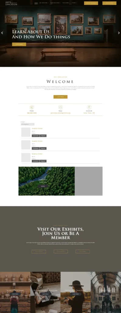
The results were clear: Functional clarity drives better engagement across every major metric.
| Metric | Original (Variation A) | Updated (Variation B) | Change |
|---|---|---|---|
| Median time to locate service and program information | 74.55 seconds | 58.14 seconds | More than 16 seconds faster |
| Donors rating navigation high in ease (6 or 7 out of 7) | 58% | 77% | +19 percentage points |
| Perceived trustworthiness | 31% | 42% | +11 percentage points |
| Median time spent reviewing the site | 70.5 seconds | 102 seconds | +31.5 seconds of engagement |
| Perceived clarity | 65% rated it clear | 81% rated it extremely clear | 24% net positive lift in sentiment |
| Site donors would feel more comfortable supporting | — | 58% | Majority preference for Variation B |
When we asked donors for overall impressions and sentiment feedback, they spent a median of 102 seconds thoroughly reviewing Variation B compared to 70.5 seconds on Variation A, showing that clear navigation encourages deeper engagement, not hurried site abandonment.
Making It Stick
We couldn’t just file this research away and call it done—our design team needed new tools to keep building this way.
So we wrote a standardized AI prompting guide to help product designers generate new page layouts that keep in place the navigation structure, trust anchors, and guided writing prompts that make these templates work.
At the same time, that same research-backed structure has also given the team room to get creative.
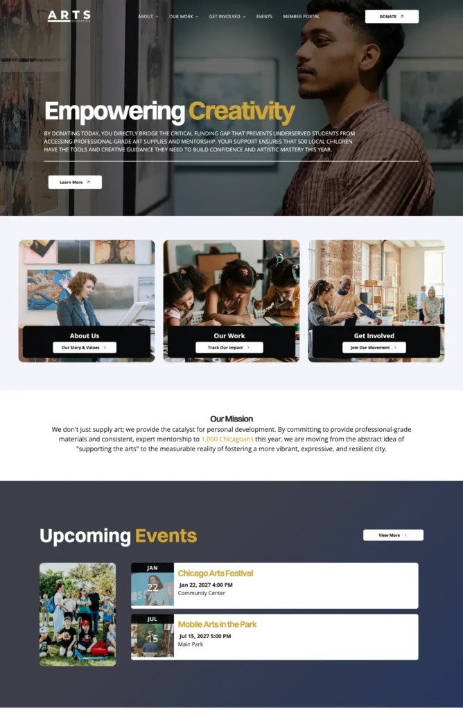
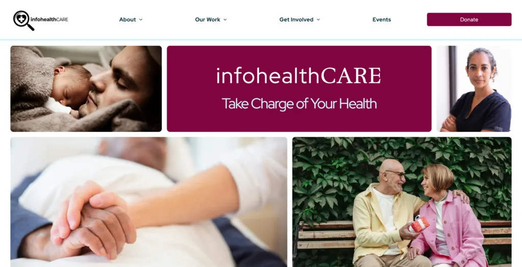
Our designs range from bento box layouts to minimalist to highly vibrant templates, giving nonprofits fresh, visually engaging ways to display impact metrics without losing navigation clarity.
It’s Always About the People Behind the Mission
Nonprofit leaders and staff don’t log into work each morning to build websites. They log in to mentor young artists, clean local rivers, feed families, and advocate for their communities.
Technology should never feel like an additional obstacle standing between a dedicated team and the people they serve.
By taking the time to listen deeply to real nonprofit builders and the donors who support them, we built a template system that honors the human effort behind every organization.
It gives teams a vision to bring to their board and step-by-step guidance to write their own story—so the software gets out of the way and they’re free to focus on what matters most: making an impact.
Build a Website That Works as Hard as You Do
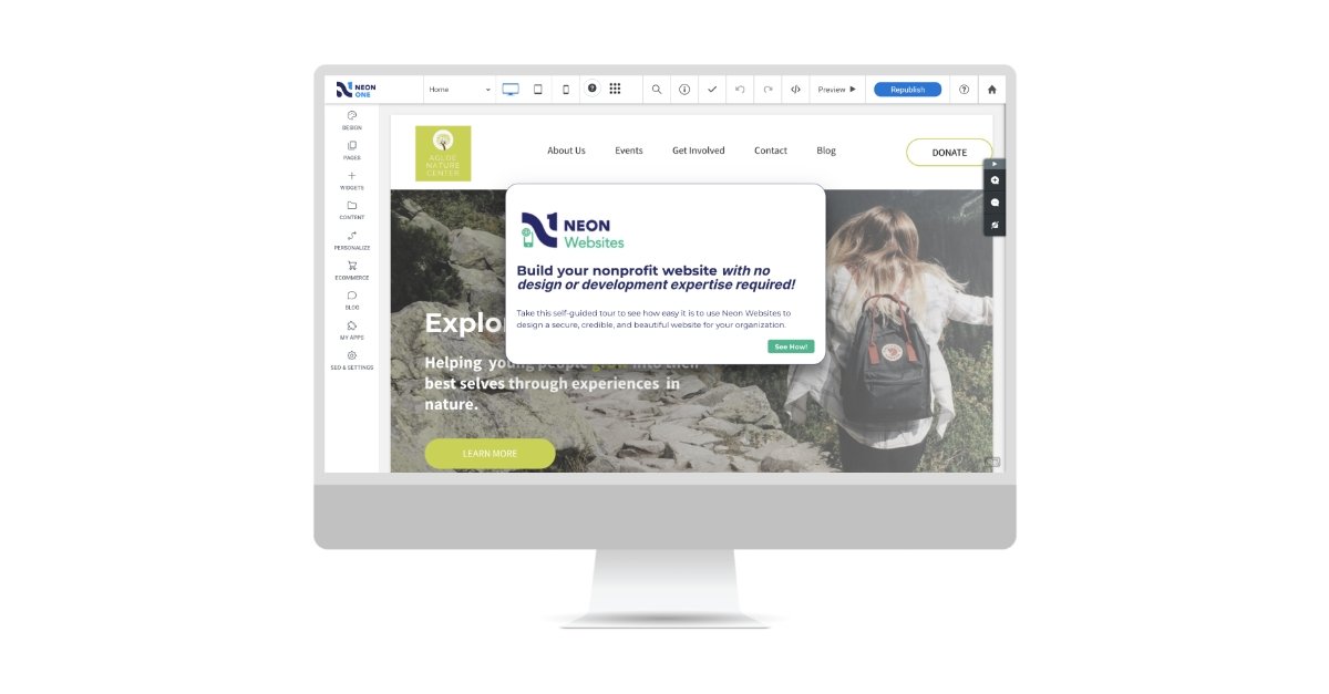
With Neon Websites, you can use our drag-and-drop editor, stylish nonprofit templates, and seamless integrations to create a website that inspires your supporters. Learn more on this self-guided tour!

Author Bio
Kerry McNamara, Web Designer
Kerry McNamara is a Web Designer at Neon One with a specialization in UX and Product Design. Driven by curiosity and user research, she has spent four years taking complex, multi-layered challenges and turning them into streamlined digital systems. Outside of work, Kerry can be found performing music or exploring the outdoors.