
Nonprofit calls to action are what drive people to take the next step. They may appear on your website, in emails, at the end of social media posts, and even on direct mail materials!
In this article, we’ll focus specifically on the calls to action you need for your nonprofit website. That’s because your website not only needs to inform visitors but more importantly, your organization’s website needs to inspire them.
You need a way to motivate website visitors to take action and support your nonprofit’s mission—that’s where calls to action come in.
What Are Nonprofit Calls to Action?
A call to action (CTA) button is the button on a website or other multi-channel marketing and communications efforts that prompts you to “Donate Now”, “Subscribe to Our Blog”, or “Learn More!” CTAs encourage your visitors to show their support and inspire a specific action that can help your mission.
Since a call to action will directly influence your website visitor’s behavior, it’s important that it’s effective. Picking the right design and color is crucial, but choosing the right words is equally important. The words in your CTA button need to be compelling enough to make your visitors take action.
Your call to action should be as specific as possible, while also using as few words as possible. Don’t just ask people to donate; tell them exactly what materials you need and how their donation will make an impact. Specificity is what sets successful nonprofit calls to action apart from the rest.

Three Steps to Compelling Nonprofit Calls to Action
Even though a call to action may be the shortest phrase on your website, it’s important that it makes an impact. Follow these three steps to create a call to action button guaranteed to inspire your constituents.
1. Make It Urgent
A huge part of your call to action is simply creating a sense of urgency about your cause. Use strong language to make your website visitors feel like waiting isn’t an option—they need to act now.
Using words like “now” or “today” will help you create urgency, but you should also think creatively about how you can inspire your visitors to take action—one example could be personalization.
You want people to understand the importance of supporting your cause today. It’s the difference between a “Donate” CTA and more urgent ones like “Take Action Today” or “Get Involved Now.”
Whether you use a shocking statistic, a compelling visual, or mention a specific timeline, a sense of urgency makes nonprofit calls to action more effective.
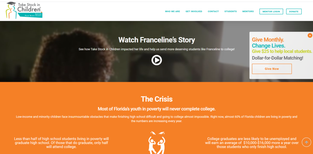
Take Stock in Children Today does this well. Their name alone conveys urgency, but if you go to their website, you’ll find a popup button that encourages you to give now to change the lives of their students.
You’ll find pictures and stories of the students they help, along with strong language that includes information about the crisis at hand—that most of Florida’s Youth in poverty will never complete college.

2. Use Strong Language
Nonprofit calls to action need strong verbs to make the biggest impact. Avoid the passive voice and, instead, use active verbs that will inspire your visitors to take action. Some of our favorite examples include:
- Support
- Donate
- Act
- Change
- Fight
- End
- Transform
- Invest
You want calls to action that tug on people’s heartstrings and tie donors’ involvement directly to positive impacts. Using strong language in nonprofit calls to action is a way to evoke emotion and encourage people to act.
Specificity also makes nonprofit CTA language stronger (“Support a Child Today” vs. “Donate”). There are so many potential call to action options for nonprofit websites, so brainstorm a few different phrases before settling on one.
When in doubt, opt for whichever phrase you think is the most attention-grabbing.
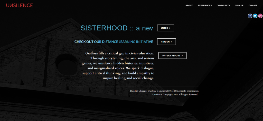
Unsilence does a phenomenal job of this. Front and center, you see three major calls to action: “Enter,” “Hidden,” and “10 Year Report.” This unique website structure, coupled with bold and direct calls to action, grabs the attention of visitors right away.

3. Keep It Short And Sweet
Your entire call to action should only be a few words long at most. Get straight to the point and make it short and sweet. If you need to add additional context, add it before or after the CTA, but limit the actual call to action button to just a few words.
If you’re worried about cutting down the length of your call to action, use the WYLTIWLT test to make sure your call to action button will make sense to website visitors.
In your head, add these phrases before the text of your call to action:
- Would you like to _________?
- I would like to _________.
This allows you to test whether your call to action button makes sense from both the voice of the website and the voice of the user.
This is the standard format for CTA buttons across the internet, and we find that this test helps us cut down our call to action phrases to the most important keywords necessary for user understanding.
Consider including a simple visual element to complement your nonprofit calls to action. People tend to process images faster, and including visuals along with your call to action may make a greater impact than text alone.
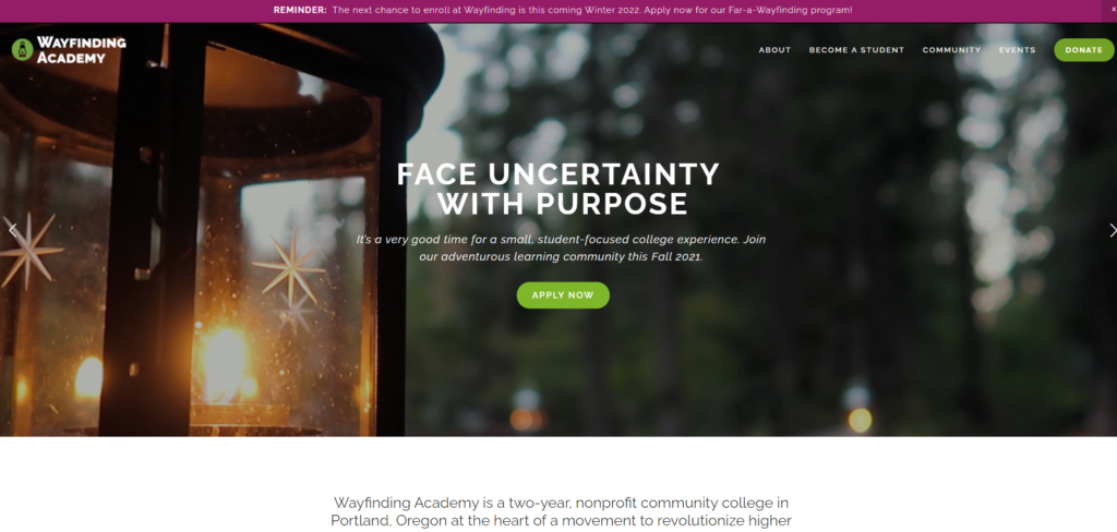
For example, Wayfinding Academy features a carousel of three initiatives with calls to action front and center. To “apply now” to be a student in their program, as pictured below, to “learn more” about their free tuition initiative, and to watch the founder of Wayfinding Academy’s Ted Talk now.
All nonprofit websites are different, so it’s hard to know exactly what will work best for you. Our best advice: Try to boil down the motivation behind your cause into a few powerful words—something that would inspire anybody to make a difference.
For more tips on how to perfect your nonprofit’s website, check out the blog below:

Build a Nonprofit Website That Inspires Supporters
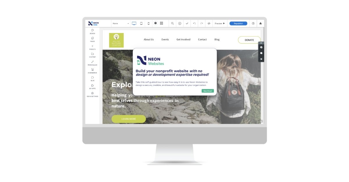
Even the best nonprofit calls to action are only effective on a well-designed, easy-to-navigate website. If your organization’s website is struggling with long load times, responsiveness, or integration, you’ll be happy to know that Neon Websites delivers beautifully designed nonprofit websites with no coding required!
When you create your site with Neon Websites, it’s responsive from the start and makes it easy for visitors to learn more about your mission and find where to donate. Let our powerful yet simple website builder and editor make having a modern nonprofit website a breeze—take a simple, self-guided tour today!
Build a Website That Works as Hard as You Do
With Neon Websites, you can use our drag-and-drop editor, stylish nonprofit templates, and seamless integrations to create a website that inspires your supporters. Learn more on this self-guided tour!