You’ve just poured your heart into a fundraising campaign. People are excited by the story you’re sharing, and they’re ready to give right now. They click the link and land on your donation page.
What happens next? Depending on the choices you made when setting up your organization’s donation page, they might make a gift and leave happy, or they might get frustrated halfway through, abandon their gift entirely, and leave … not so happy.
We hope you have an outstanding donation form that is a fast, frictionless, and beautiful experience—one that makes giving simple and secure. But if your page is feeling a little clunky and confusing and is inspiring too many donors to second-guess their decision to give, we’re here to help.
In this post, we’re going to dive into 10 real-world donation page examples—all built using Neon One—that show you what your page could (and should) be doing.
How We Selected Our Outstanding Donation Page Examples
As part of our Dream Big 2025 event, we hosted a competition amongst Neon One customers to see who had the best donation page.
Submissions were judged by a cross-functional panel of Neon One team members and evaluated on their clarity of purpose, ease of use, visual appeal, storytelling, and trust and transparency.
This post highlights 10 exceptional donation pages which were submitted to the competition; we’ll start with the three pages that won!
The 3 Dream Big Award-Winners
When it came to handing out awards, we were mindful of the difference in resources between smaller and larger orgs, which is why we awarded three prizes: one for small nonprofits, one for midsize nonprofits, and one for large nonprofits.
Here are those three winners, and some insights into what makes their pages so special!
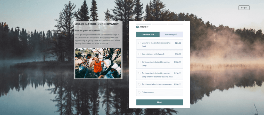
1. Saint Paul Urban Tennis (Winner: Small Nonprofit)

St. Paul Urban Tennis uses the power of sport to build character and leadership in local youth. With a focus on equity, mentorship, and skill-building, their programs serve as a launchpad for brighter futures—both on and off the court.
What Stands Out
- Clarity of impact: The page does an excellent job of showing exactly what a donation will accomplish and ties each giving level to a tangible outcome.
- Simple and clean design: The layout is clean and easy to follow, with headers and visual styling that guide the eye.
- A nice range of giving options: Options include one-time, monthly, quarterly, or annually—and even an option to “Pay Later” by check or money order, which gives donors flexibility and the organization a chance to follow up if a donation doesn’t come through.
Key Takeaway
While a clean design and clear giving options are essential, tying each donation amount to a tangible outcome makes the donor’s contribution feel real and immediate. This clarity can be a huge motivator for someone who is ready to give.
2. Council on Criminal Justice (Winner: Midsized Nonprofit)

The Council on Criminal Justice is a nonpartisan think tank working to advance a fairer, more effective justice system. Grounded in data and driven by solutions, they bring together leaders from across the spectrum to turn bold ideas into real reform.
What Stands Out
- Easy navigation & trust-building: The donation page is super straightforward and easy to navigate. There are also solid trust signals: It mentions their 510(c)(3) status and includes contact information.
- Use of video: A short 30-second video covers who CCJ is, what they do, and their overall impact. It helps to ground their mission right away.
- Thoughtful form features: There is a checkbox to indicate if a gift will be matched by an employer and an open note field where you can share any comments or follow-up requests with the staff, which is a nice personal touch.
Key Takeaway
A short video that quickly covers your work and impact can be a helpful tool to ground the mission right away. A video paired with clear messaging can help connect with donors to make your work feel both important and timely.
3. Lifeline Global Ministries (Winner: Large Nonprofit)

Through faith-based mentorship programs, Lifeline Global Ministries equips incarcerated individuals and their families with tools for transformation. Their work helps break cycles of incarceration and restores lives in the process.
What Stands Out
- Demonstrated impact: The video is especially powerful as it clearly shows what donations support and builds an emotional connection through real stories and outcomes.
- A compelling ask: The written story explains how they’re dealing with reduced funding, which both humanizes the donation request while also adding urgency.
- Accessibility & trust: There is clear guidance on optional fields and thoughtful form labels (like noting when a donation is on behalf of a church). They also build trust by linking to their GuideStar profile, ECFA membership, and a full disclosure statement.
Key Takeaway
Creating an emotional connection is a powerful tool to inspire people to make their donation. Adding information that emphasizes the urgency and humanizes your request for a donation also makes a big difference.
7 More Inspiring Donation Pages
Beyond the three pages that we crowned as our winners lay a ton of other wonderful submissions, all of them built using Neon One’s donation form builder. Here are seven of our favorites!
4. Alzheimer’s San Diego
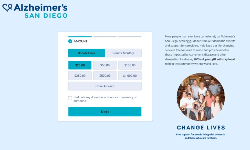
Alzheimer’s San Diego is there for families facing dementia, providing local care, education, and support—all at no cost. And, since 100% of donations stay in the community, every gift makes an immediate, local impact.
What Stands Out
- Questions in their form: The form includes additional questions that are helpful to engage with donors: ‘What motivated you to give today?’ This can be helpful for reaching out if there’s a personal connection, or can help you gain insights on why donors are giving to you.
- Additional ways to engage: The form includes opt-ins for newsletter and estate planning legacy gifts.
5. Palmer Land Conservancy

Palmer Land Conservancy protects Colorado’s land, water, and local food systems so future generations can thrive. Their preservation work stretches from farmland to mountain trails, and they’re just getting started.
What Stands Out
- Compelling imagery: They use gorgeous photography and colors that work really well together.
- Clear and concise text: Their message is clear and concise about where your money goes. It’s easy to read and understand.
- High trust: The footer includes a 501(c)(3) statement as well as tax ID number and tax information, which all help donors to feel secure that they’re giving to a trustworthy organization.
6. Nimbus Dance

Blending performance, education, and community engagement, Nimbus Dance is redefining what it means to be a cultural anchor. Whether they’re putting on bold productions or offering free classes, they use movement to connect and inspire.
What Stands Out
- Strong branding: The donation page is extremely branded and has a unique design, including photos that showcase their focus in dance and performance.
- Clear and concise text: The form includes an optional question (What led you to donate today?), which, as noted above, can help them understand how they got donors and offer insight into where their monthly vs. higher amount donors are coming from.
- Additional opportunities: The form includes an employer match search, which can help donors increase their impact, and a newsletter signup, which can help you stay in touch with your donors after their gift.
7. I Support the Girls

I Support the Girls believes that dignity is a basic human right and that bras and menstrual products shouldn’t be luxuries. They distribute millions of essential hygiene items to people experiencing homelessness, poverty, or distress.
What Stands Out
- Fun and unique colors: The striking color combination stands out, and this unique color palette is memorable.
- Playful language: The text includes puns, and they provide fun (and funny) directions to name your bay, which makes it fun to donate.
- Clear updates on impact: They make it clear that you will get a detailed account of what your donation is being used for, which is a fun way to keep donors in the loop and help them directly see their impact.
8. The Diaper Bank of Greater Cleveland
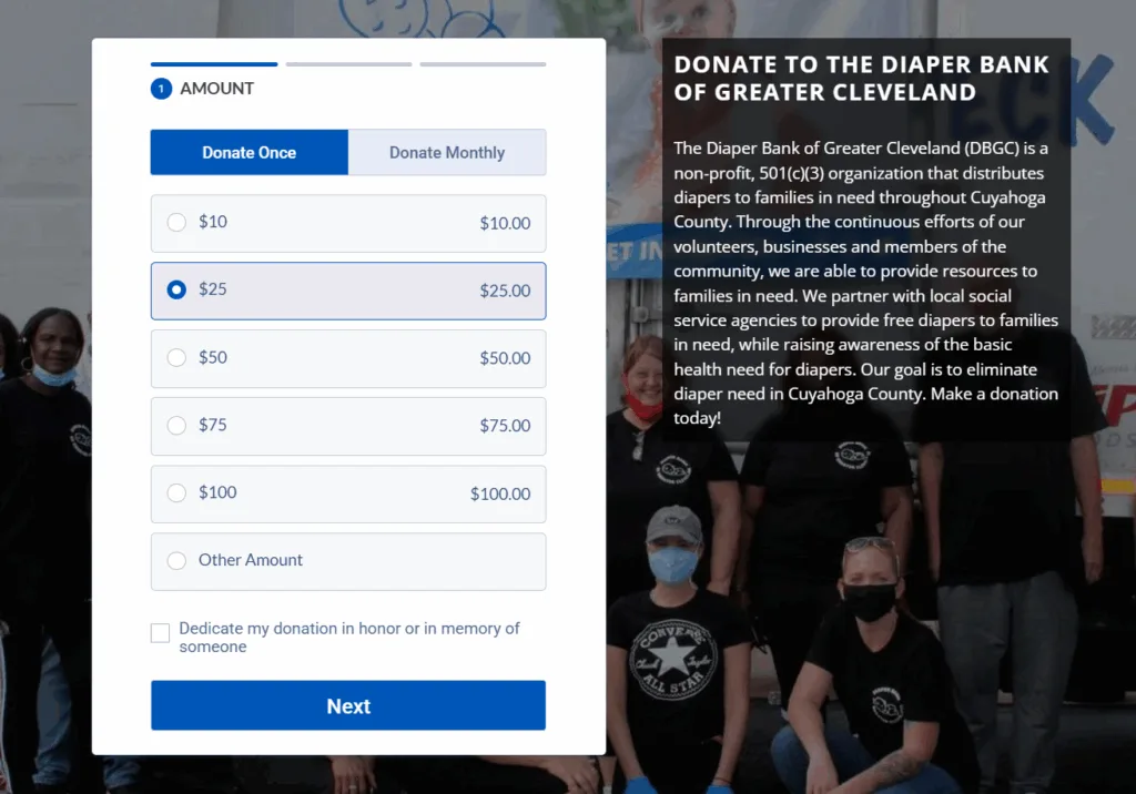
No one should have to choose between diapers and dinner. The Diaper Bank of Greater Cleveland supports families in need by providing diapers, period products, and incontinence supplies because every person deserves basic care.
What Stands Out
- Clear mission statement: Their mission statement is extremely clear, and they give detail that explains how they accomplish their mission with local agencies.
- “In-kind” donation option: The option to “donate diapers” in the header is a nice option for folks who may want to donate something other than money.
9. Babylon Chorale

Since 1950, the Babylon Chorale has brought choral music to Long Island audiences with passion and artistry. They are a community ensemble that thrives on connection between singers, songs, and the people who listen.
What Stands Out
- Flexible giving options: their form offers one-time, monthly, quarterly, and annual options, providing donors with flexibility about when they make their gifts.
- Their purpose is clear: The text provides clear information about what donations support, the mission, and the purpose of the organization.
- Trust-building features: Their page explicitly mentions that they’re a 501(c)(3) and includes links to both their social media and contact info, which adds credibility to their work.
10. Prevent Blindness Texas
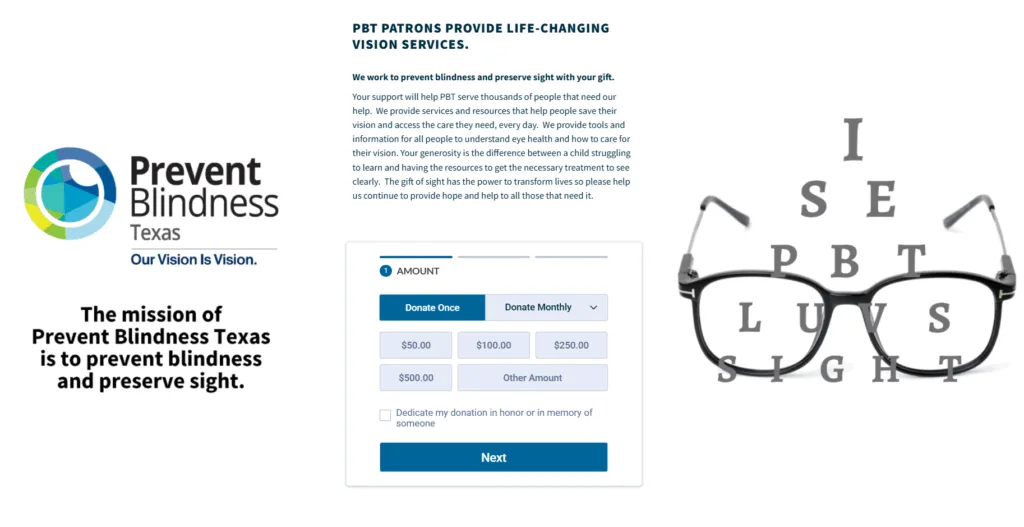
For over 65 years, Prevent Blindness Texas has been dedicated to saving sight. Through screenings, education, and advocacy, they work tirelessly to prevent vision loss and ensure every Texan has access to eye care.
What Stands Out
- Visuals: The visuals on the page are both striking and memorable.
- Their work is clear: The mission statement on the left, along with the header and text, helps to provide context and purpose to the work that they’re doing.
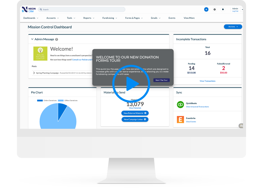
Donation Forms That Practically Fill Themselves
With Neon CRM, you can spin up an unlimited number of fully optimized, totally customized donation forms.
Putting These Lessons into Practice
These pages are a testament to the fact that a donation page is so much more than a form! It’s an opportunity to build trust, reinforce your brand, show the impact of your work, and help people connect to the work you’re doing.
The best donation pages are simple, clear, and trustworthy. They make it easy for donors to give. Whether it’s a compelling video, beautiful branding and design, or thoughtful form features, you can turn your transaction into a meaningful experience.
As we mentioned up above, all these pages were created in Neon One’s CRM using the system’s donation form builder tool. It’s really cool! And it’s super easy to use.
If you’d like to see that form builder in action (it can build all kinds of forms, by the way, not just donation forms), click the button below and take a self-guided tour.