As online giving has become more common, donation page best practices have evolved. What worked yesterday might be holding you back today!
If you haven’t revamped your donation pages or forms recently, now’s a good time to do so. The earlier you make these changes, the sooner you’ll start seeing better conversion rates.
In this essential guide, we’ll be covering donation page basics, from why you need a donation page to how to optimize your donation forms—plus a handy donation page checklist that helps you put these tips into action.
Download the Donation Page Checklist
Table of Contents
For easy access, we’ve linked all of the sections below, so you can find exactly what you’re looking for:
Donation Forms That Practically Fill Themselves
With Neon CRM, you can spin up an unlimited number of fully optimized, totally customized donation forms.
What Are Donation Pages?
Donation pages are the landing pages—usually on your website, sometimes free-standing—that house your nonprofit’s donation form. That form contains the actual fields where donors enter the information like their name, email address, and payment details that are needed to process and record their donation.
You can think of the difference between your donation form and your donation page as the difference between “where” and “how.” Your donation page is where your donors go to make their gift, and the donation form is how they complete the transaction.
Since a high-performing donation form is by far the most important element of your donation page, it might not surprise you to learn that a) most people use these terms pretty interchangeably, and that b) most of what we’re going to talk about in this article is more about optimizing your donation form versus the donation web page itself.
Why is a Great Donation Page Important?
For many nonprofits, donations make up a significant portion of their funding. Even if you have revenue coming in from other channels like grants and major gifts, online donations are still an essential part of funding your work.
The goods news is that online giving makes it extremely easy to give whenever and wherever your donor may want. The not-so-good news is that just because someone navigates to your website—or even to your donation page—doesn’t mean they will always actually donate.
Without a well-built donation page, you risk losing out on donors and long-time supporters. In fact, the average nonprofit donation page sees a 50-70% abandonment rate.
If your donation page is long, confusing or loads slowly, you may risk losing a potential gift. That’s why having a great donation page is so important!
The 8 Core Elements of a Nonprofit Donation Page
While no two nonprofits are exactly the same, there are a number of best practices that come into play when building a donation page for your organization.
Here’s a quick list of seven must-have elements for any nonprofit donation page:
- Donation Form: A form that collects a donor’s name, email address, mailing address, communication preferences, and payment type and information (credit card or online payment field). Later in this piece, we’ll talk further about how much information you should try to capture in your form.
- Imagery: A high-impact image prominently featured on your page that relates to your mission or brand with a few lines of copy reiterates someone’s decision to give. If you are creating a donation page that’s specific to a certain campaign, choose an image that relates to that campaign.
- Impact Statements: Copy that impresses upon donors how the gift they’re about to make will have a positive effect on a real (or composite) person. Include impact statements for your various donation amount and frequency options explaining what a gift of this size would allow your nonprofit to do
- Suggested Donation Amounts: Use information from your nonprofit CRM to determine average giving levels and use those to set these donation amounts. Your form should always include the option for donors to choose their own custom amount.
- Recurring Donation Options. Recurring donors are one of the greatest partners a nonprofit can have. While you can’t count on recurring donation options to do all the work for you, they pair well with a dedicated campaign to encourage monthly (or quarterly or bi-weekly) giving.
- Mobile-Optimized Interface: Your donation page should offer a user-friendly experience no matter what type of device (mobile, tablet, or desktop) a donor is using. And, with the popularity of mobile browsing forever on the rise, prioritizing mobile is a must.
- Social Media Sharing Buttons: Attach these to the donation confirmation page with copy encouraging your donor to spread the word. But until users arrive at that page, make sure you don’t include any elements that would take them away from your form.
- CRM Integration: When your online donation forms are integrated with your nonprofit’s CRM, accurate, instant data will be available in your database as soon as your donor clicks “submit.” No manual updating, no waiting days for the two systems to sync.
While there’s a lot that goes into making a great donation page (and don’t worry, we’ll cover that all depth), those core elements are the ones that any successful page will need to employ.
That last element we mentioned—a CRM integration—means finding a system that offers built-in donation forms. If you’d like to check out the top nonprofit CRM systems on the market (including our own solution, Neon CRM), then check out this article:

Optimize Your Donation Page in 9 Steps
Think of this section as an online donation optimization checklist that you can use to help your nonprofit create the best possible platform for giving.
Let’s dig into it!
Step 1: Create Mobile Responsive Donation Pages
If you have a website, you want it to be usable on mobile devices. The same is true of your donation pages. You want them to be easy for donors to use, no matter which device they choose to use when visiting your site.
Some steps you can take to ensure your donation pages work well on different devices include:
- Using an online fundraising platform with mobile-optimized forms
- Compressing large image files (like your hero image) to reduce load time
- Using standard fonts that will display well on mobile devices
- Ensuring checkboxes and buttons are easy to tap on small screens
What’s the best way to check your donation page’s user experience on mobile? By testing it yourself! Have staff and volunteers at your organization try and use the donation form via their Apple and Android devices and flag any issues they encounter.
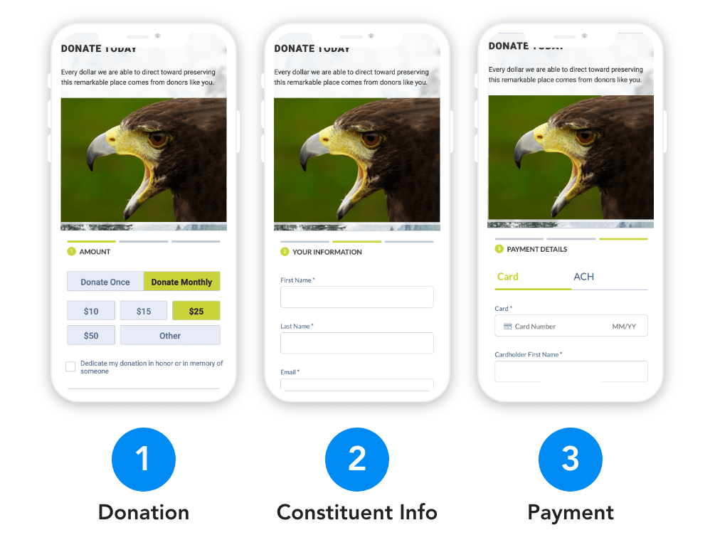
Step 2: Use a Multi-Page Donation Form
By using a donation form that breaks the process down into multiple different pages–one page for donation amount, one for contact info, one for payment details, etc.–your form will makes the whole transaction seem easier to complete.
How does it do that? By capitalizing on the phenomenon known as “cognitive momentum.” Once a donor completes the first step of their multi-page transaction, they’ll feel like they’ve already committed to making the purchase. The rest is just details.
The same amount of information posed to donors as a single form might overwhelm them, but embed a multi-page form on your donation page and you will likely see conversion rates rise.
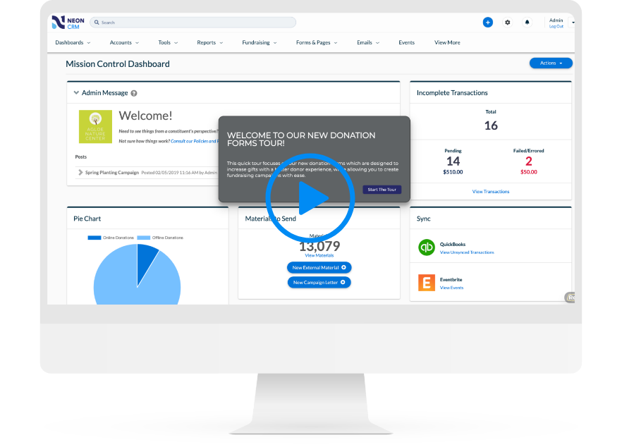
If you’re a Neon CRM user, this is easy for you to do. When you create a new donation form, just choose to use the multi-page donation form option. Here’s what it looks like!
Step 3: Brand Your Donation Form
Branding your donation form is a great way to instill trust in your donors. In fact, branded online donation forms convert seven times more donors than non-branded forms.
Simply put, branding your donation pages means using your organization’s logo, fonts, color scheme, and other brand elements to make the page look and feels like the rest of your nonprofit’s website and digital communications
If you haven’t established a style guide for your nonprofit, we highly recommend you take some time to do so.
Want to see a style guide in action? Check out Neon One’s style guide for some inspiration.
Step 4: Minimize Your Form Fields
Nobody likes filling out long forms, especially if you’re asking for lots of personal information.
So, while it might be tempting to add a ton of different fields to your donation form to capture as much information as possible, asking for too much information during your donation process is going to increase the likelihood that a visitor will fail to complete their transaction.
All of a sudden, that brand new donor is just another one that got away.
Instead, you should keep the fields to a minimum on your donation form and then send your new donor a get-to-know-you donor survey soon after they’ve completed the transaction.
Learn more about what questions to include in your donor survey in the article below:

Step 5: When You Ask for Information, Tell Them Why It’s Necessary
When you are asking your donor for information that goes beyond the bare minimum required to complete their transaction, let them know why you need that info.
With phone numbers, specifically, always provide context. Requesting a phone number on your donation form without sharing how you’ll use it is a great way to kill your conversion rate.
Asking for an email address, on the other hand, is fairly standard. But be sure to let your donor know exactly what they are signing up for. Even better, include a check box that allows them to opt into a newsletter or other marketing communications.
Otherwise, make clear that you are asking for their email strictly to confirm and follow up regarding their transaction.
Step 6: Add Recurring Giving Options
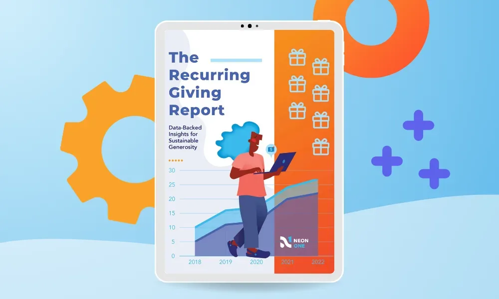
According to Neon One’s 2024 Recurring Giving Report, recurring giving have proven to be some of the most effective and resilient investments that a nonprofit organization can make.
Did you know that recurring donor bases grew by 127% between 2018 and 2023? And the average donor lifetime for a recurring giver is a whopping eight years? Download the report to learn more.
With a good donation page, you can make recurring giving easy for your donors and increase your donor retention rates. All you have to do is include an option for recurring or monthly donations right under the donation amount field.
If you take this approach, consider creating different suggested donation amounts (with corresponding impact statements) for this type of gift.
Step 7: Use Security Indicators to Signal Trust
If a potential donor feels unsure about giving your organization their credit or debit card information, then they’re almost surely not going to complete their donation online.
One way to help put worried minds at ease is to include a security indicator (also called a “trust indicator”) on your donation form.
What’s a trust indicator? It could be something as simple as a little padlock icon or the words “secure payment” on the bottom corner of your form. Or both, like the example below:
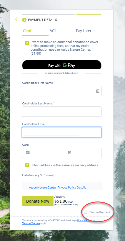
Don’t believe that this will improve your conversion rates? You don’t have to take our word for it.
An experiment by NextAfter found that the simple action of adding a box indicating that a form was secure resulted in a 126% increase in donations!
Step 8: Add Social Share Buttons to Your Confirmation Page
By now, you’ve probably created a Facebook Page. Maybe you’ve taken things to the next level with Instagram. If you’re really brave, you’re even on TikTok.
Now it’s time to make social tools a part of your donation process by adding social sharing buttons to your confirmation pages.
Thank your donor for their gift and invite them to follow you on your social media channels. It’s a great way to move someone from your donation page to other online channels where you can connect with them more easily.
Social media is about building legitimacy and credibility. Every share helps expand your reach to a new network of people that weren’t on your radar before.

Step 9: Use Data and A/B Testing To Keep Improving
All these best practices we’ve covered are great, but you can’t just put them in place and call it a day. You’ll need to keep experimenting and tweaking to see how you can make your page even better.
Here are three things you’ll definitely want to do as you work to optimize your donation page and maximize your online giving.
- Use data from past giving campaigns to learn what kind of elements your nonprofit’s donors might respond to in a donation page. Your mission, donor base, and community are unique, spend some time combing through your organization’s donor database to see what kind of trends emerge.
- Conduct A/B tests to learn which new elements work and which don’t. An A/B test means creating two different versions of your page, sending a version of each form to different donor groups, and seeing which version of the page performs best.
- Find your donation page’s conversion rate to set a baseline against which you can improve. You can calculate this rate by taking the number of unique visits to an online donation page divided by the total donations processed by that page. You’ll do this for every version of your donation page(s). If you conduct an A/B test and find that one version of your new donation page has a much higher conversion rate, then that’s the version you should use.
Download the Donation Page Checklist
Want to get started on optimizing your donation page?
Download this handy donation page checklist to keep you organized and on task.
Plus, you’ll get even more great tips for making your donation page donor-friendly!
Your Donation Page Checklist
This handy dandy seven-step checklist will help you optimize your donation page for a stellar donor experience—the kind that raises completion rates and sets the stage for repeat giving.
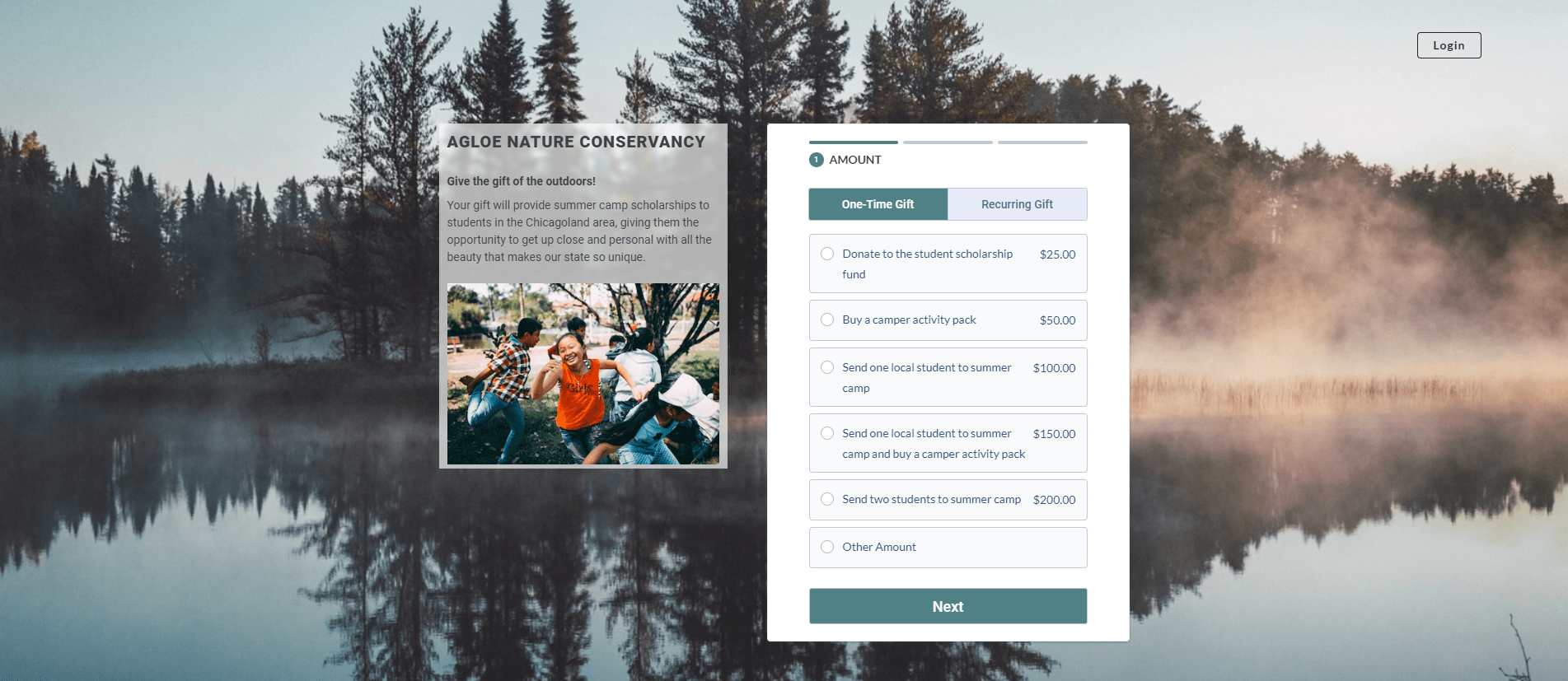
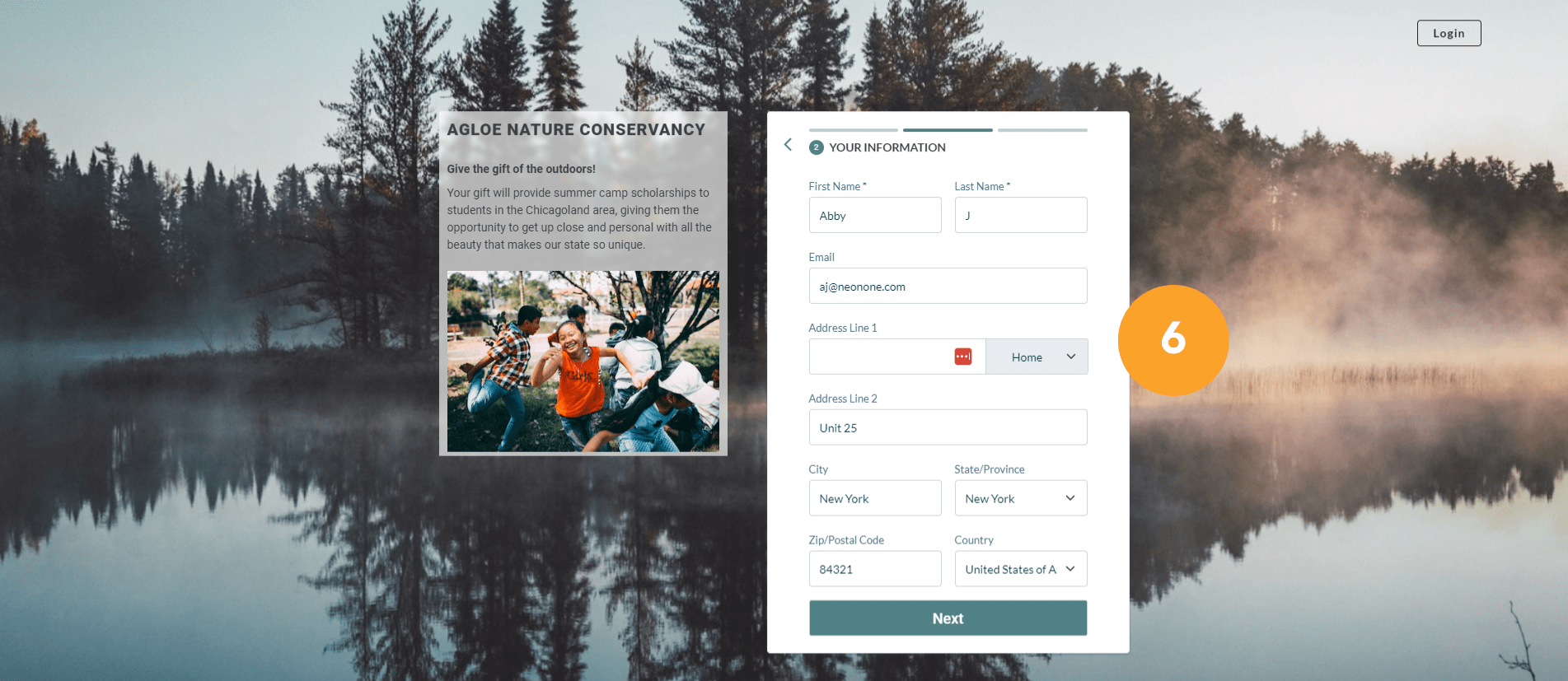
Use This Example Donation Page as a Guide
Reading about best practices is useful. But seeing them in real life is even better!
Here’s an example donation page we made for a (fictional) nonprofit that’s raising money to send students to summer camp.
First, notice how the organization’s branding—especially its images and color scheme—is applied to the page.
Then, take a look at each of the numbered donation page elements. They each correspond to a donation page best practice!
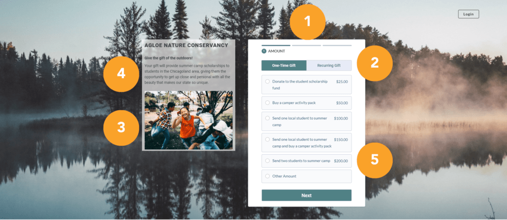
1. This donation page includes a multi-step format that breaks the donation process into simple steps.
2. Donors can choose to make a one-time donation, but there are also recurring options on the form.
3. A high-quality image helps donors envision the children they’ll support when they make a gift.
4. Above the image is some well-written copy that reiterates a donor’s impact.
5. The donation form includes suggested giving options with descriptions, which will help donors decide how much they want to give.

6. This form includes minimal additional fields, which means the donation process is short and simple
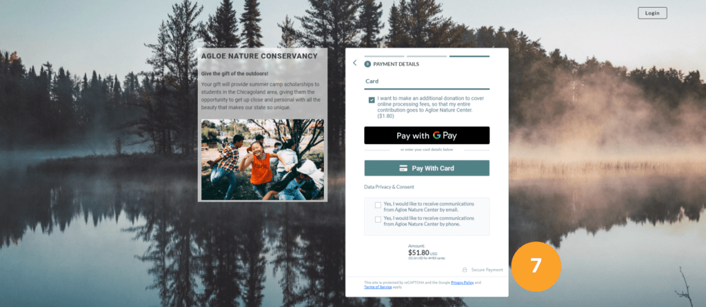
7. Check out the security indicators on this donation page—they’re a subtle signal to donors that their information is safe
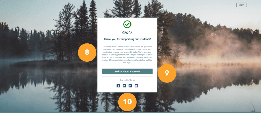
8. This thank-you message on the confirmation page wraps up the donor’s experience and makes them feel good about their generosity
9. Anyone who completes this form is given the chance to take a donor survey to tell the organization more about themselves
10. Notice the social sharing options on the confirmation page—they make it easy for your donor to spread the word about your work
Want to dig into this topic a little more? Check out our complete analysis of this donation form example.

How Does Neon CRM Help?
Neon CRM provides unlimited custom donation forms that are perfect for nonprofits regardless of size.
Our powerful fundraising software enables you to fully personalize your donation pages, including various options for branding and content.
With Neon CRM, you can create a donation form that’s right for your organization.
Best of all? All of your data automatically synced up to your CRM, which eliminates the need for manual data entry.
You’ll be able to access all the information you collect on your donation pages immediately, meaning less room for error and more time to focus on fundraising.
Tour Our Donation Form Builder!
Does your online fundraising platform make it easy to create effective donation pages? Neon CRM does!
You can build a beautiful donation page in minutes and customize the fields on your donation form.
And, since they’re part of your CRM, your donors’ information will automatically appear in their donor profile—no manual uploading and downloading required.
See for yourself how simple it is to build great donation pages in Neon CRM with our self-guided tour!


