
Your nonprofit landing page is like your digital welcome mat. And if there’s one thing welcome mats need to be, it’s welcoming. After all, most people would rather walk up to a door where the mat says “Yay! We’re So Glad You’re Here” than “The Dog Bites. Leave.”
So when you’re crafting a nonprofit landing page, you’re not just building another spot on your website—you’re creating a dedicated, single-purpose page that is designed to make your supporters feel welcome, excited, and inspired to take a specific action.
What Exactly Is a Nonprofit Landing Page?
When you click a link in an email, an ad, or a social media post and you’re taken to a specific page on a website, that dedicated, standalone page, designed for one specific action is a landing page.
Imagine your nonprofit’s website as a big, bustling office building. The homepage is like the main lobby, welcoming everyone and pointing them in all sorts of directions—learn about your mission, see programs, read stories, make a donation, see the latest news about your work, etc.
A landing page, on the other hand, is a very specific meeting room designed for one clear purpose. When someone finds a landing page, they’re there to do one thing—no distractions, just targeted action.
No matter what the target action is (e.g make a donation, register for an event, sign up to volunteer, download a resource, etc.), the landing page should guide supporters directly to this call to action (CTA) in a way that is easy—maybe even enjoyable.
So, how can you build a nonprofit landing page that truly works? And what are the key elements for a page that delights and converts? Let’s get after it.
How To Build a Nonprofit Landing Page That Works
Define Your Goal (and ONLY One Goal!)
We’d venture to call it the golden rule of nonprofit landing pages: Set one clear goal. Is it a donation? An email signup? A volunteer application? Be specific. Trying to do too much confuses people, and having multiple asks, buttons, or too much information can hurt your chances of getting people to take action.
Know Your Audience
Before you write a single word, you’ll want to answer one key question: Who are you talking to? Tailor your page to specific donor segments or supporter groups that you’re aiming to engage. Make sure the page speaks to who they are, and, more importantly, what they care about.
For example, are you trying to get first-time donors to make a donation to your cause? Or offering long-term volunteers new ways to get involved? Different groups of people (often called “personas”) will respond to different messages.
Understanding your target audience’s interests, motivations, and concerns will help you craft a message that speaks directly to them.
Craft Your Message
Now that you’ve honed in on your goal and audience, it’s time to craft your message—the emotional core of your landing page. What challenges are you addressing? What impact will you make? Don’t just talk about your programs; focus on the tangible benefits that your CTA will create.
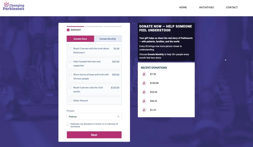
Instead of just asking people to “give to the cause,” this donation landing page for Changing Parkinson’s, a nonprofit that helps Parkinson’s patients live their best lives, shares how each donation amount will make a direct impact. $5 will reach one person with the truth about Parkinson’s, $25 will help five people feel seen and supported, etc.
The Anatomy of a High-Converting Nonprofit Landing Page
Your goal, audience, and message are complete. Now the next step isn’t as scientific as it might sound, but there are some key elements of a nonprofit landing page that can help you convert your page visitors into action-takers.
You’ll want to make sure that your landing page checks these boxes:
One Crystal-Clear Call to Action (CTA)
As we stated above, your CTA is the single most important thing that you can have on your page. This is the “next step” you want people to take, so make sure it’s clear and easy to find.
Your CTA should be a prominent button with clear action-oriented language (“Donate Now,” “Sign Up to Volunteer,” “Download Guide”). It’s often helpful to use a contrasting color on the button to make it stand out.

An Engaging Headline
Grab your visitors’ attention immediately with a clear, concise, and benefit-oriented headline. It should mirror the ad or link that brought them to the site.
Powerful Imagery or Video
Show, don’t just tell. Use authentic, high-quality photos or videos that evoke emotion and show impact. Make sure your imagery is relevant to the action you’re asking people to take. It often helps if your imagery evokes positive emotions in your audience.
Compelling Story, Concise Copy
Your story of impact or need should move visitors, but it shouldn’t be overwhelmingly long. Focus on the problem, your solution, and the impact that people can make by completing the CTA. Keep your text scannable and easy to digest; using bullet points can be helpful.
Trust-Building Elements
People need to trust you to want to take action. Make sure your landing page has clear branding that makes your organization look professional and reliable. Do you have testimonials or data that can reiterate your impact? If so, those can be helpful to include on the page.
Simple Forms
When people go to take action, make sure you don’t ask for too much info! Why? Because including too many fields may result in people leaving the form before they finish. That’s why you should only collect the information needed to complete the action. If you’re building a donation form a donation form, this seven-step set-up guide can help avoid common mistakes like these.
Thank You Page and Automated Follow-Up
When someone takes action, their experience isn’t over. Immediately redirect them to a thank-you page that confirms their action and shares your gratitude. Even better, you can trigger an automated follow-up email that reinforces their impact, provides any necessary next steps (like a receipt), and reiterates your appreciation for their support.
Optimizing and Testing Your Nonprofit Landing Page
You’ve crafted a strong landing page (check that off the lengthy to-do list ✅). But to make sure it’s doing everything it can for your mission, it’s equally as important to optimize and test it. This ongoing process helps you fine-tune everything to make sure your page is converting as effectively as possible.
Mobile Responsiveness
Mobile users represent 53% of all nonprofit website traffic, which means a large chunk of potential supporters will likely engage with your page from a phone or tablet. It’s essential to make sure that your landing page not only looks great on mobile devices, but that your CTA button, forms, etc. are easy to find and complete on a mobile device as well. No one has time for tiny text, hard-to-find buttons or squishy-looking pages!
Page Speed
Impatience is real. 25% of website visitors will abandon a website if it takes more than four seconds to load. A faster loading page means a smoother user experience—the less time it takes to load, the more likely people are to stick around and ultimately take the action that you want them to.
A common culprit of slow page loading can be large images, so make sure to compress or resize any really large images. Take advantage of free tools to test your page speed.
A/B Testing
Don’t just guess, test! Think of A/B testing like a science experiment for your nonprofit landing page. You create two slightly different versions of the page — “Version A” and “Version B”— and split incoming traffic, sending half to A and one to B. You then see which version performs better based on your defined goal.
Test one thing at a time, like different headlines, different imagery, your CTA button text or color, see if shorter or longer text gets more traffic. You could even test how many fields are in your forms and see what converts best! Tools like PostHog will let you create limited A/B tests for free.
Tracking and Analytics
Once your nonprofit landing page is live, you need to understand how people are engaging with it. You can use tools like Google Analytics to see how visitors interact with your page.
Some metrics that can be helpful to track are:
- Conversion Rate: What percent of people actually complete your desired action?
- Traffic Source: Where are your visitors coming from? Social media, email, search engine, ads? Knowing this can help you see which marketing efforts are most effective.
- Bounce Rate: The percent of visitors who land and leave without interacting. A high bounce rate can mean your page isn’t engaging or user-friendly.
By understanding where visitors come from, what they do (or don’t do) on your page, and how many actually take action, you can make smart and informed decisions to continue to perfect your landing page.
Oh, P.S. Google Lighthouse can also be a helpful tool to audit your site for performance, accessibility, SEO, and more.
Common Pitfalls to Avoid on Your Nonprofit Landing Page
Now by this point, we’ve shared a lot about what to do to make your nonprofit landing page exciting and engaging. If you want a little TL;DR, here’s a quick hit list of pitfalls that you should aim to avoid when creating your pages:
- Too Much Clutter/Information Overload: Keep it focused.
- Conflicting CTAs: One goal, remember?
- Lack of Clear Value Proposition: Why should they care?
- Poor Mobile Experience: A quick way to lose supporters
- Forgetting the “Thank You”: Confirmation pages and follow-up.
Whether you have an established website or are just getting started, it’s important that your nonprofit landing pages not only get people’s attention but also get people to take action. By following the steps outlined above, you should be well on your way to reaching the goals you have set out for yourself.
Also, the gentle and friendly reminder that you don’t need to tackle everything all at once. You can start small, iterate, and learn from the process. You’ve got this! And we’re here to support you in your efforts as you turn your supporters’ interest into impact!
Set Yourself Up for Success with Neon Websites
This website design tool includes all the features you need to build and manage a nonprofit website and nonprofit landing pages. Its intuitive interface and drag-and-drop design functionality mean anyone can create a beautiful website, even if they don’t have design or coding experience.
It’s simple enough that you can build a new website in a few hours, and it’s powerful and versatile enough to support your unique mission, brand, and content needs.
New to the Nonprofit World? Check Out Neon Launch
In order to have a landing page, you first need a website. And for brand-new nonprofits, setting up a decent site—especially one that’s ready to take donations—can feel pretty daunting! That’s why we created Neon Launch, a new offering from Neon One that is designed to help new and early-stage nonprofits get online quickly. It includes everything they need to launch their website, raise money, and start building relationships from day one—all without any tech expertise.

Ready to Launch Your Mission Online?
Neon Launch gives you a professional website, donation tools, and integrated payment processing—everything you need to start strong and grow support.