What’s your approach to creating a donation page? Do you build a utilitarian page that simply collects your donors’ information? Or do you think through how you can give your supporters the best possible experience?
In an ideal world, you’ll do a bit of both. Your donation page needs to effectively collect important information about your donor and their gift. But it should also include thoughtfully chosen design elements that reiterate your supporters’ instinct to give and make them feel good about their decision.
If you’re creating (or updating) your nonprofit’s donation page and want to build something that’s effective and enjoyable for your donors, keep reading!
If you’re looking for an in-depth look at all the ins and outs of donation pages, we’ve got just the resource for you: check out our ultimate guide to donation pages. But if quick tips are more your current speed, then you’re in the right place.
3 FAQs About Creating a Donation Page
Before we dig into creating your donation page, here are answers to four common questions about the whole process.
Your donation page is a landing page that people see when they click the “donate” button on your site and that you link to in appeal emails or social posts. Your donation form is the tool you’ll use to collect information about your donor and their gift. Donation pages house donation forms.
Here are the four key parts you’ll need on any nonprofit donation page:
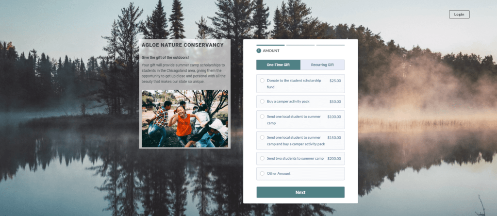
1. Visual branding elements that create a sense of continuity for donors
2. A compelling image that connects donors to the people they’ll support
3. Concise copy that reiterates their gift’s impact and reinforces their decision to give
4. A donation form that moves people through the process of completing their gift
The donation form bit probably makes sense to you—but what about the design elements?
Creating a donation page that uses your organization’s branding elements (like your logo, colors, and fonts) and includes great imagery and compelling copy is an important tactic.
But why?
Put yourself in your site visitors’ shoes. You can’t know with certainty how familiar they are with your organization’s work and impact before they get to your donation page. You want everyone who sees this page to have a reason to give, and you can give it to them right then and there.
Help Your Donors Complete Their Gift
Donors give because they want to make a real difference for people. Your hero image will help them understand how their gift will make a tangible impact, and your copy will reinforce that message. When you show them something related to your work in your community, potential donors have a better understanding of how their gift will be used.
Your donation page should help your donors…
- Get excited about giving. An appealing donation page with thoughtfully chosen copy and imagery will reinforce someone’s instinct to give and create a deeper connection between them and the community you serve.
- Make their gift easily. Giving to a cause—even one your donor really loves—isn’t like paying an electric bill. It doesn’t matter if filling out the form to pay a bill is a pain; you’re going to finish it anyway. But if filling out a form to donate is annoying, people just won’t give. Keep your required fields to a minimum and focus on making the giving process quick and easy.
- Feel fantastic about giving. People’s instinct to give is driven by their emotions and their identity. Understanding the psychology behind giving—and using that understanding to make your donors feel good about their support—is an important part of donor retention. Your donation page and the elements it includes should support that.
Does your donation page do that? If not, evaluate your current page with our tips below in mind.

How to Create a Donation Page
Your goal is to get people excited about giving, make it easy for them to complete their donation, and evoke feel-good emotions during the process.
1. Spin Up Your Donation Form
Log into your online fundraising platform and generate a new donation form. During this process, you’ll name your form and choose your form URL. You’ll also probably choose the layout for the form, assign it to a particular campaign, and establish general form settings. If you’re using Neon CRM, you’ll also choose a theme for your page.

2. Enable Recurring Giving
Recurring donors—people who commit to making ongoing donations on a regular basis—are some of a nonprofit’s most valuable supporters. They’re easier to retain than people who make one-time gifts, and they tend to support their favorite organizations for years at a time.
There are lots of tactics you can use to build a base of recurring donors, but the first step is to enable recurring donations on your donation form.
3. Add Your Copy
Not everyone who lands on your donation page is committed to making a gift. They may not even have a solid understanding of who you are and what you do!
Write some introductory copy that helps donors understand who your organization is, what you do, and how their support will make a difference. You’ll let new visitors know what will happen when they support your work, and you’ll reinforce determined visitors’ desires to make an impact by donating.
4. Choose Your Visuals
One or two thoughtfully chosen images will work with your copy to make people feel great about giving and give them insight into what their gift will achieve.
Choose a photograph that will connect people who visit your donation page to the community they’ll help when they give. Images that include a single subject (or a small group—think three or four people) are a good choice. Pictures where at least one subject is making eye contact are even more effective.

5. Set Up Your Donation Form’s Fields
Your fundraising platform will automatically include the fields necessary for processing donations. Collecting information like your donor’s name, email address, payment method, and billing information is obviously important—but what other fields should you enable on your form?
If you want to use your donation form to collect information about your donors, you’ll need to be very, very deliberate about what you ask. Adding additional fields to a donation form has a negative impact on conversion rates, so choose carefully!
Try adding a single additional field—like asking someone what inspired them to donate or inviting them to opt into receiving emails from you—and save additional questions for a follow-up survey.
6. Add Suggested Donation Amounts
Suggested donation amounts make the donation process easier by helping donors decide how much to give. If you choose to add descriptions for each suggested amount, you can give donors insight into how their gift may be used.

7. Update Your Confirmation Page
Making people feel good about their donation is key to building a relationship with them. Your confirmation page can help you!
Instead of using the confirmation page’s default messaging, add a more personal message. Thank your donor, tell them their kindness and generosity will make a difference, and give them a next step, like taking a donor survey or watching a thank-you video.
Donating to a good cause feels good. Updating your donation confirmation page will keep those good feelings going, and it’ll make people more likely to engage with you in the future.
8. Test Your Donation Page
After you’ve created your donation page, the final step is to test it a few times to make sure it’s working smoothly. Run through the process and see if you notice any typos, awkward form fields you can eliminate, or anything else that would confuse or discourage a donor.
Ideally, you’ll test your donation page on at least two devices—a desktop computer and a mobile device. You get bonus points if you test on both an Android and an iOS device!

4 Advanced Tips for Optimizing Your Donation Page
Looking for ways to make your donation page even more effective? Here are some tips.
Do: Add Different Suggested Donation Amounts for Recurring Gifts
As a general rule, one-time donations tend to be larger than monthly donations. That doesn’t mean you shouldn’t ask for recurring gifts! But it does mean that you may want to set up suggested amounts for recurring donations that are different from the ones you created for one-time gifts.
This is an opportunity to write new impact statements, too. Tell your recurring donors what they’ll help make possible when they give. It’ll make your recurring options even more appealing.
Don’t: Forget to Make It Accessible
Your donation page should be accessible in every form of the word. It should be easy for all visitors to access, fill out, and submit your form.
Creating a donation page with accessibility in mind will help ensure everyone can support your cause regardless of their needs and circumstances. Some steps you can take include ensuring all images on your page include alt text, following the ADA’s color contrast guidelines, and double-checking that it’s easy to navigate your form using a keyboard instead of a mouse.
If you’re interested in learning more about making your donation page (and the rest of your website) more accessible, you’ll like this article on creating an accessible donor experience.
Selected post not found.
Do: Give Donors Some Options
People are most likely to complete a gift when they can give the way that’s most convenient for them. Add options that make that possible!
We’ve covered adding suggested donation amounts and recurring giving options. Some other options you may want to consider include adding things like:
- Billing options for recurring gifts (monthly is standard, but quarterly and even annual options may be appropriate)
- Payment options, like PayPal or eCheck, in addition to card payments
- Options for giving to specific campaigns or programs
- Options to dedicate a gift to a loved one
Be thoughtful about what options you give your donors. The goal is to make giving easy and convenient.
Don’t: Add Too Many Options
While you’re adding those options, resist the temptation to get carried away! A few carefully chosen options make giving enjoyable, but too many options can feel overwhelming. Limit the number of decisions your donors need to make while donating, and revisit your form regularly to see what fields and choices you can eliminate.

You’re Ready to Create a Donation Page!
There you go—eight steps for creating a donor-friendly donation page and four tips for making it as effective as possible! You’ll spin up your donation page, customize your design elements and copy, and make sure the fields in the form are straightforward and easy to understand. Then, you’ll make some additional tweaks to make sure it’s accessible and makes giving convenient.
If you’d like some help building your page, download our handy donation page checklist to make sure you don’t miss a thing.
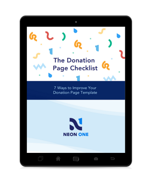
Your Donation Page Checklist
This handy dandy seven-step checklist will help you optimize your donation page for a stellar donor experience—the kind that raises completion rates and sets the stage for repeat giving.